


Football
Share
Published 10:54 24 Jul 2016 BST
Explore more on these topics:
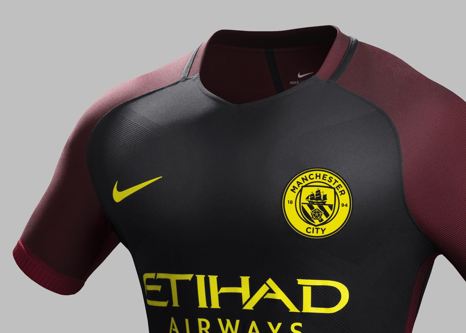
 The kit, which goes on sale from August 4 on the Nike website, is predominantly black with red details on the shoulders, down the sides and on the shorts along with flashes of yellow.
 Even the club's new crest has been given another new look in the yellow and black of Manchester's emblematic 19th Century worker bee. Because history.

Football

Football

Football

Football
Man City threaten legal action after Real Madrid Erling Haaland transfer claim
The club have seen enough Manchester City have threatened legal action after a Real Madrid presidential candidate claimed that he could bring Erling Haaland to the club. As part of his president campaign, he stated on Spanish TV that the Norwegian striker had a release clause and wants to join the Spanish giants. Though the […]
Football
1 day ago
How the final Premier League table would look if every refereeing error was erased
Things would have looked very different. Every major refereeing decision leading up to the final few weeks of the Premier League season have been analysed, to establish how things may have played out differently, had PGMO officials always made the correct calls, in an impressive new report from the Athletic. The 2025/26 season ultimately ended […]
Football
1 day ago
The Premier League club most impacted by VAR mistakes has been revealed
Football


