Leeds United have a new club crest.
On Wednesday afternoon, Leeds unveiled a redesign of their crest to mark the team’s centenary in 2019. According to a club statement, the Championship side settled on the new badge following “six months” of research and after consulting “more than 10,000 people connected to Leeds United.”
Here’s what they settled on:
6 months of research
10,000 people consulted
Ready for the next 100 yearsWatch video ➡️ https://t.co/rIIdL2Yz9F pic.twitter.com/pMrd3zTjCl
— Leeds United (@LUFC) January 24, 2018
And here’s a closer look:
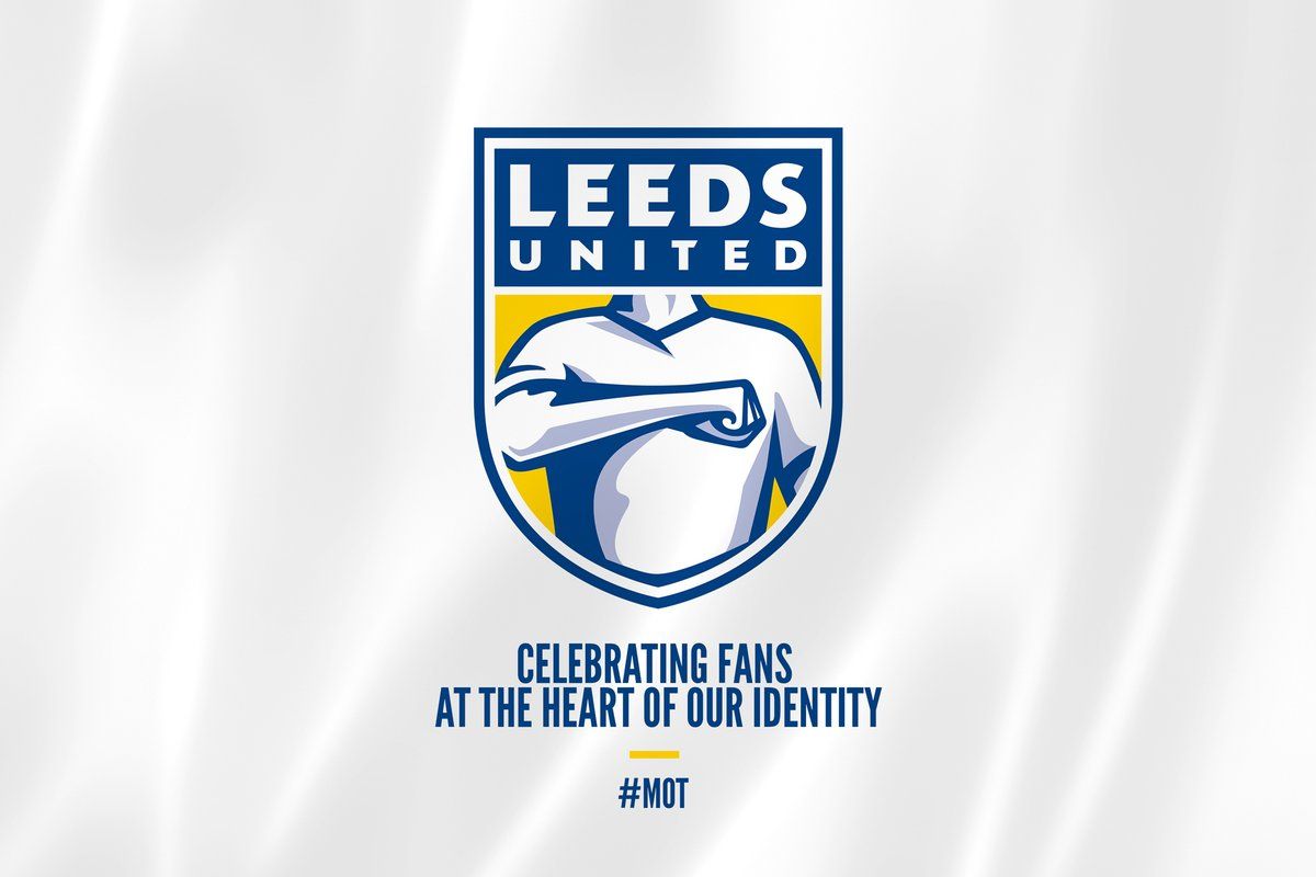
It does look like a team crest from Pro Evolution Soccer circa 2003, and it is a significant departure from Leeds badges of the past.
The online reaction to the new crest has been mixed, as is always the case when anything ever happens.
One Leeds blogger called the new design “absolutely tragic” and an online petition has been launched to try prevent the club implementing the new crest.
That badge is absolutely tragic. Who the hell was consulted? #lufc
— I'd Radebe Leeds (@Radebe_Leeds) January 24, 2018
The club asked 10,000 people over 6 months about the new #lufc badge…
It's taken less than 2 hours for a petition to stop #lufc implementing the "salute" badge to reach 10,000 signatures. pic.twitter.com/v6oRHPUDCZ
— I'd Radebe Leeds (@Radebe_Leeds) January 24, 2018
So, maybe there’s still time for the folks at Leeds to change their minds. We asked people on Twitter to redesign the crest, and some of these might be a better option for the three-time English champions.
Fixed it. pic.twitter.com/oLwkcGncsQ
— FootballJOE (@FootballJOE) January 24, 2018
Fixed it. pic.twitter.com/xQnimUBNcl
— FootballJOE (@FootballJOE) January 24, 2018
https://twitter.com/hrtbps/status/956145297499082752
https://twitter.com/ThurstanStHouse/status/956144065250316288
https://twitter.com/randallbell/status/956142248206458880
https://twitter.com/Ifcjosh/status/956142022074695681
— Wayne Farry (@waynefarry) January 24, 2018
#AltLeedsBadge pic.twitter.com/AyeJyyMVbw
— Budge (@jlbudge) January 24, 2018
https://twitter.com/pepromano/status/956150637758242817
https://twitter.com/robprice27/status/956155437761679360
https://twitter.com/ellandread/status/877868358489825280
#AltLeedsBadge pic.twitter.com/Uaur97dNGL
— Tim Middlewick (@TMiddlewick) January 24, 2018