


News
Share
Published 13:46 4 Apr 2026 BST
Updated 13:47 4 Apr 2026 BST

NASA has launched humankind further than ever before into space with the launch of Artemis II.
On Wednesday, 1 April, the mission successfully took off with the crew now bound for the Moon.
The 10-day mission will send four astronauts around the Moon in the Orion spacecraft to test life-support systems, navigation, and deep-space maneuverability before future lunar landings.
The four astronauts on humanity's furthest ever journey into space are NASA's Reid Wiseman, Victor Glover and Christina Koch, and Jeremy Hansen of the Canadian Space Agency.
The crew have sent some images back from their history-making trip, but one photo has lots of people down on Earth all saying the same thing.
Wiseman, who is Commander of Artemis II, took a dazzling image of our planet, and released it via NASA.
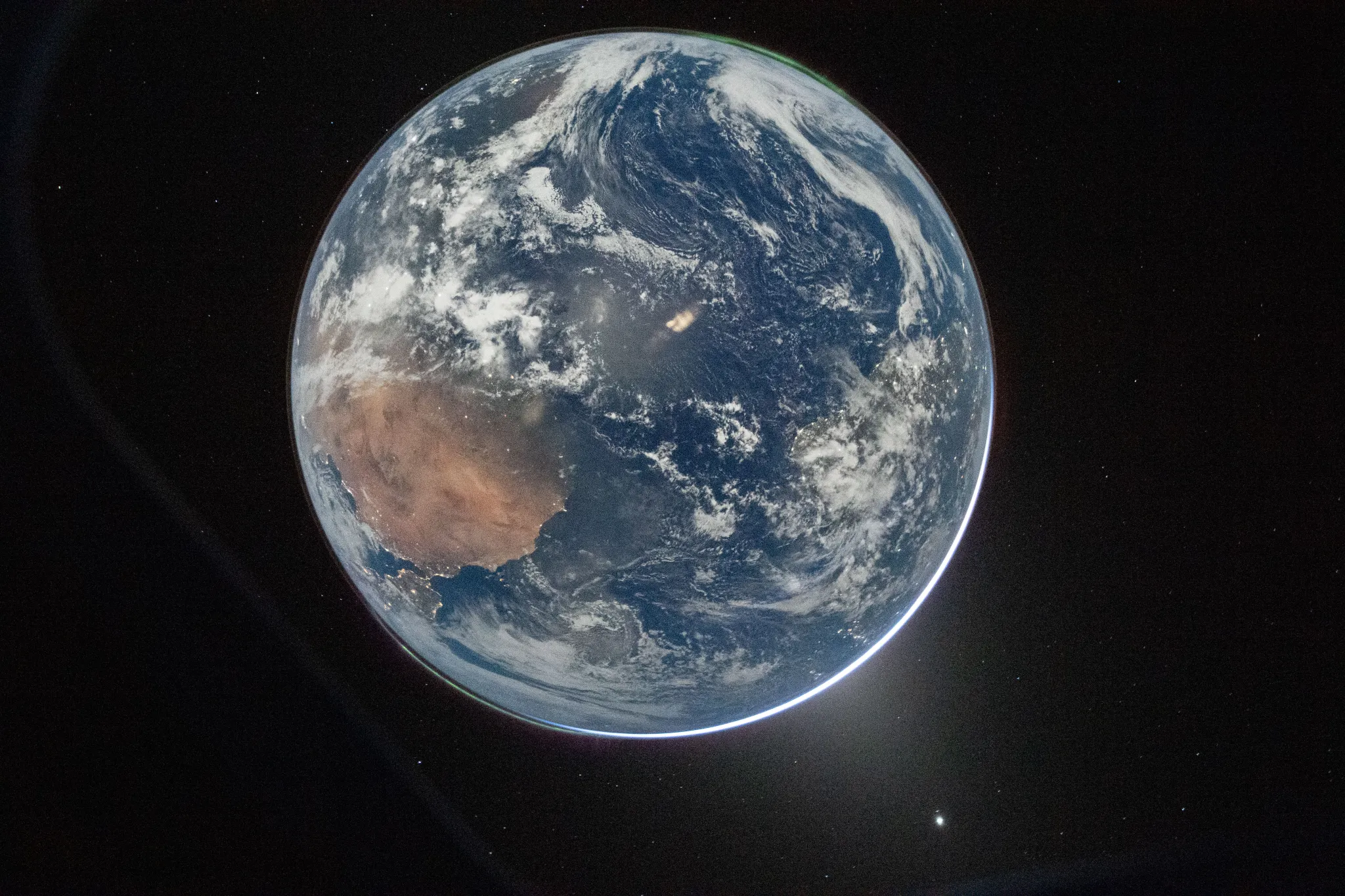
The image, titled 'Hello, World', was taken from the window of the spacecraft after they completed the translunar injection burn.
"There are two auroras (top right and bottom left) and zodiacal light (bottom right) is visible as the Earth eclipses the Sun," NASA said.
However, the space agency made the mistake of comparing the new image with a picture from Apollo 17's mission in 1972, and the internet has a lot to say about it.
"We’ve come so far in the last 54 years, but one thing hasn’t changed: Our home looks gorgeous from space! The left view is from the Apollo 17 crew in 1972 and the right was captured yesterday by the Artemis II crew," NASA wrote.
People have responded to the tweet by pointing out how dull the 2026 image looks compared to the one from 1972.
"The old Earth image looks sharper while this new image looks dull," one person wrote. "Camera quality or climate change?"
Another penned: "Why does the one from 72 looks better?"
"What are we doing so wrong . The earth looks pale. We are losing it," a third put.
However, other users on social media offered an explanation for the stark difference in colourings on the images.
"What you're looking at is actually the night side of earth, opposite the sun. It looks grainy because the image is hyper exposed for visibility," one user explained.
Another offered: "The side of the Earth photographed in 2026 appears to be in nighttime. Hence the arc of brightness at the bottom right."
While a third added an explanation about the difference in cameras: ""Earth didn’t change - how we capture it did. The colour difference between the 1972 “Blue Marble” and modern Earth images comes down to technology.
"Apollo 17 used film cameras, which naturally boosted colour and contrast. Today, digital sensors, atmospheric correction, and colour calibration are used.
"Most modern images are also composites, not single shots. That’s why today’s Earth can look less 'vivid'."
Explore more on these topics:


News

News

News

News
Tsunami warning triggered in Mexico after 7.3 magnitude earthquake
A tsunami warning has been triggered A tsunami warning has been triggered in Mexico after a 7.3 magnitude earthquake hit off the coast of the North American continent. The quake was recorded off the cost of Chiapas in Mexico, as per the United States Geological Survey (USGS). As per Sky News, the earthquake struck Puerto […]
News
16h
Mother of Henry Nowak’s killer jailed for removing knife from murder scene
She’s been sentenced to three years The mother of Henry Nowak’s killer Vickrum Digwa has been sentenced to three years in jail for removing the knife used in the stabbing from the scene. Vickrum Digwa was found guilty of murder last month and given a minimum term of 21 years in jail after stabbing Henry […]
News
17h
Full list of peerages given out by Keir Starmer as outgoing PM makes Sadiq Khan a lord
News


