


Football
Share
Published 10:10 2 May 2019 BST
Updated 10:49 2 May 2019 BST

 https://twitter.com/chelseafc/status/1123845095730614273?s=12
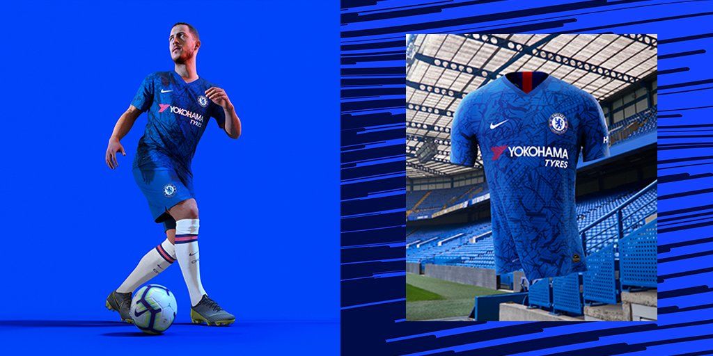
Reportedly the design incorporates imagery from the club's historic Stamford Bridge stadium, but you'd really have to squint to make out any of it.
Unfortunately for the club, one Twitter user has compared the shirt to the pattern you'd usually find on a bus seat. You know, the kind specifically placed there so passengers don't notice the dirt and grime they're actually sitting in.
Needless to say, put the two side by side and the results aren't pretty. Not a good look lads. Not a good look at all.
https://twitter.com/allezarsenal/status/1122450914994991105?s=12
https://twitter.com/chelseafc/status/1123845095730614273?s=12
Reportedly the design incorporates imagery from the club's historic Stamford Bridge stadium, but you'd really have to squint to make out any of it.
Unfortunately for the club, one Twitter user has compared the shirt to the pattern you'd usually find on a bus seat. You know, the kind specifically placed there so passengers don't notice the dirt and grime they're actually sitting in.
Needless to say, put the two side by side and the results aren't pretty. Not a good look lads. Not a good look at all.
https://twitter.com/allezarsenal/status/1122450914994991105?s=12Explore more on these topics:

Football

Football

Football

Football
New footage shows the real reason Jude Bellingham slapped Argentina star after World Cup heartbreak
Bellingham’s “random” outburst has a backstory Argentina’s dramatic semi-final 2-1 victory over England was overshadowed by a heated post-match incident involving Jude Bellingham, who found himself making headlines for all the wrong reasons. Following the final whistle, Bellingham was seen standing near a group of Argentine players as they celebrated their win. Moments later, he […]
Football
4 days ago
Football fans are just noticing Dan Burn only has nine fingers, here’s why
Quite the story Dan Burn has been impressive and very reliable since he moved to Newcastle United from Brighton and Hove Albion in 2022. The defender joined his boyhood club and has been a part of the turn around in form (with the help of a few million quid from the Saudi Public Investment Fund) […]
Football
5 days ago
Premier League club facing point deduction punishment this summer
Football


