


Sport
Share
Published 13:46 24 Jan 2018 GMT
Updated 14:00 24 Jan 2018 GMT
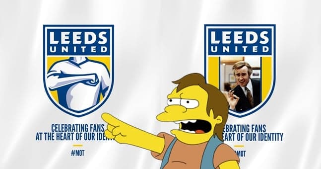
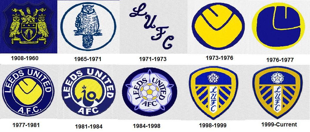
 It does look like a team crest from Pro Evolution Soccer circa 2003, and it is a significant departure from Leeds badges of the past.
 The online reaction to the new crest has been mixed, as is always the case when anything ever happens.
One Leeds blogger called the new design "absolutely tragic" and an online petition has been launched to try prevent the club implementing the new crest.
https://twitter.com/Radebe_Leeds/status/956136391120949248
https://twitter.com/Radebe_Leeds/status/956158573905629184
So, maybe there's still time for the folks at Leeds to change their minds. We asked people on Twitter to redesign the crest, and some of these might be a better option for the three-time English champions.
https://twitter.com/SportsJOE_UK/status/956146331495600130
https://twitter.com/SportsJOE_UK/status/956147134608367616
https://twitter.com/hrtbps/status/956145297499082752
https://twitter.com/ThurstanStHouse/status/956144065250316288
https://twitter.com/randallbell/status/956142248206458880
https://twitter.com/Ifcjosh/status/956142022074695681
https://twitter.com/waynefarry/status/956141849894408193
https://twitter.com/jlbudge/status/956144804945104897
https://twitter.com/pepromano/status/956150637758242817
https://twitter.com/robprice27/status/956155437761679360
https://twitter.com/ellandread/status/877868358489825280
https://twitter.com/TMiddlewick/status/956151394012196868
The online reaction to the new crest has been mixed, as is always the case when anything ever happens.
One Leeds blogger called the new design "absolutely tragic" and an online petition has been launched to try prevent the club implementing the new crest.
https://twitter.com/Radebe_Leeds/status/956136391120949248
https://twitter.com/Radebe_Leeds/status/956158573905629184
So, maybe there's still time for the folks at Leeds to change their minds. We asked people on Twitter to redesign the crest, and some of these might be a better option for the three-time English champions.
https://twitter.com/SportsJOE_UK/status/956146331495600130
https://twitter.com/SportsJOE_UK/status/956147134608367616
https://twitter.com/hrtbps/status/956145297499082752
https://twitter.com/ThurstanStHouse/status/956144065250316288
https://twitter.com/randallbell/status/956142248206458880
https://twitter.com/Ifcjosh/status/956142022074695681
https://twitter.com/waynefarry/status/956141849894408193
https://twitter.com/jlbudge/status/956144804945104897
https://twitter.com/pepromano/status/956150637758242817
https://twitter.com/robprice27/status/956155437761679360
https://twitter.com/ellandread/status/877868358489825280
https://twitter.com/TMiddlewick/status/956151394012196868Explore more on these topics:

Sport

Sport

Sport

Sport
Cristiano Ronaldo likes damning Instagram post accusing FIFA of ‘corruption’
He seems bitter even if Messi lost the final The conspiracy theory that FIFA allegedly fixed the World Cup this year is apparently supported by none other than Cristiano Ronaldo. The five-time Ballon d’Or winner appears to have shown support for video which was shared to social media and he seems into buying into the […]
Sport
1 day ago
CONMEBOL president ‘leaks’ major World Cup 2030 change in unexpected announcement
The World Cup is getting even bigger Football’s biggest tournament could be about to get even bigger after a major proposal for the 2030 World Cup. CONMEBOL President Alejandro Domínguez has announced that plans are being put forward to expand the tournament to 64 teams as part of the competition’s 100th anniversary celebrations. If approved, […]
Sport
1 day ago

Sport
FIFA responds after Argentina’s Falklands flag stunt following semi final win
Sport


