Can Leeds retain top spot?
It's been almost a year since our annual kit ranking piece, and this year it's my turn. While I care deeply about the physical appearance of kits, badges, and all the trivial paraphernalia that pertains to football, I cannot emphasise enough quite how subjective this is. So please, do not @ me.
Here's last year's
version if you want to compare.
20th - Brighton and Hove Albion

Am I putting Brighton bottom because I support their rivals? Or am I putting Brighton bottom because their badge looks like Tesco have unveiled a new own-brand salt and vinegar crisp? Yes.
19th - West Ham United
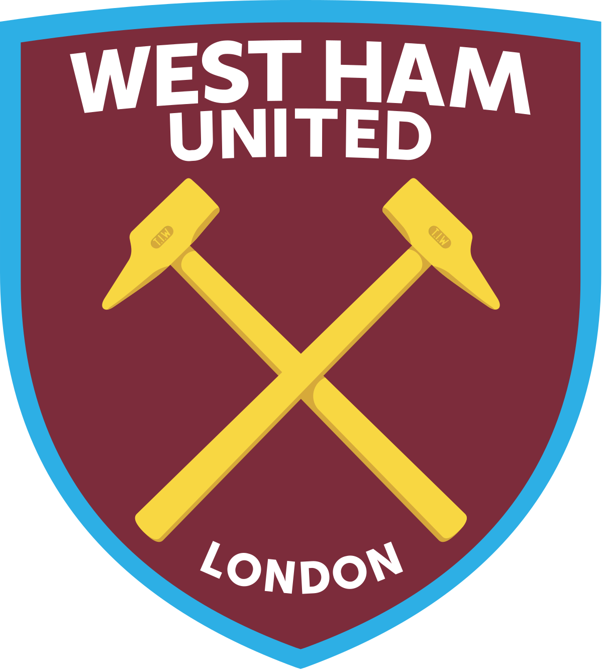
Apologies to Hammers fans, but this badge is just so boring. Its Microsoft Paint aesthetic more closely resembles a crest designed for Pro Evolution Soccer 5's 'East London' than a badge deserving of adorning the famous Claret and Blue of West Ham United. The 'London' at the bottom seems completely unnecessary as well, unless of course that's just so David Cameron can tell it apart from his other team.
The old one was better.
18th - Burnley
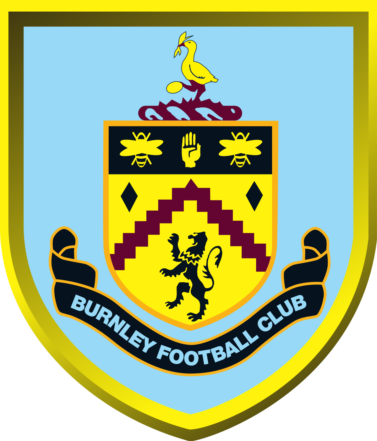
There's nothing overtly offensive about the Burnley badge, much like the football team. But, also like the football team, there is absolutely nothing about it that brings you any joy. The drop shadows are extremely Word Art™️, and the pixelation of those claret lines are jarring on the eyes.
17th - Norwich City
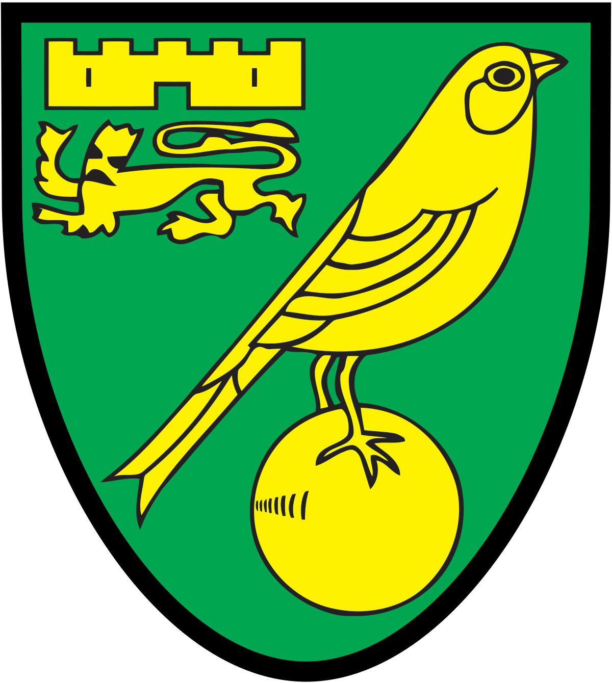
The one thing I respect about the Norwich badge is that it's not trying to do anything spectacular. It knows its purpose. There is a canary, denoting the club's nickname, and there is a stylised version of the city's coat of arms above it. But unfortunately for Norwich, yellow and green is probably the worst colour scheme imaginable. I feel sorry for their kit designers.
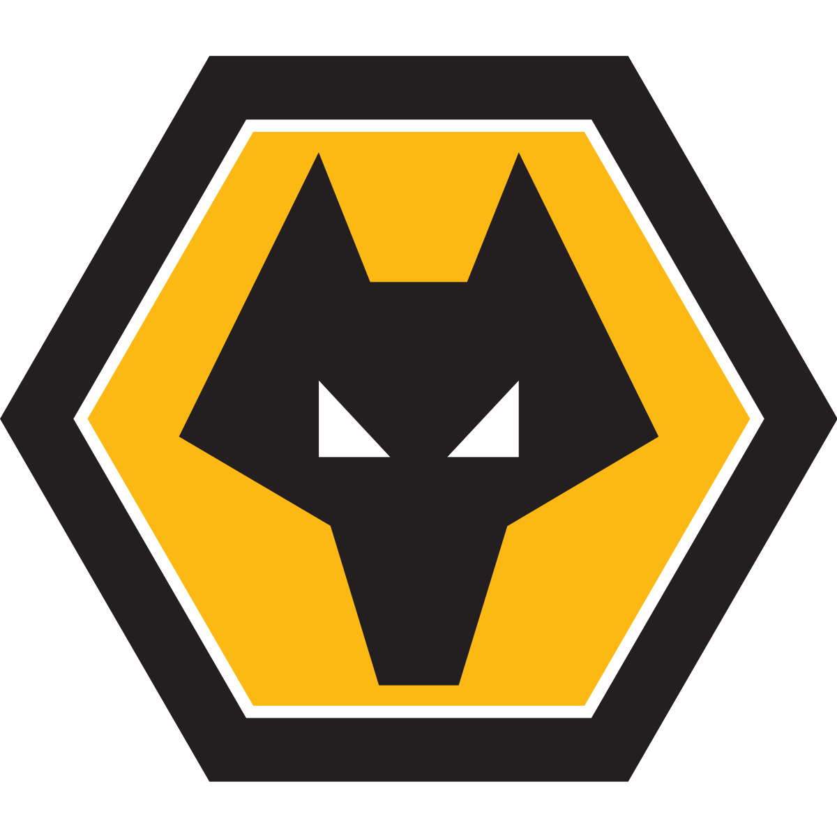
16th - Wolves
Very few clubs go for a hexagonal badge, and for that Wolves deserve plaudits. The shade of amber (Gold? Yellow? What's the official colour?) works nicely alongside the black and thin white line. But, and it's a big but, the complete absence of any text is very unsettling. The same goes for Norwich.
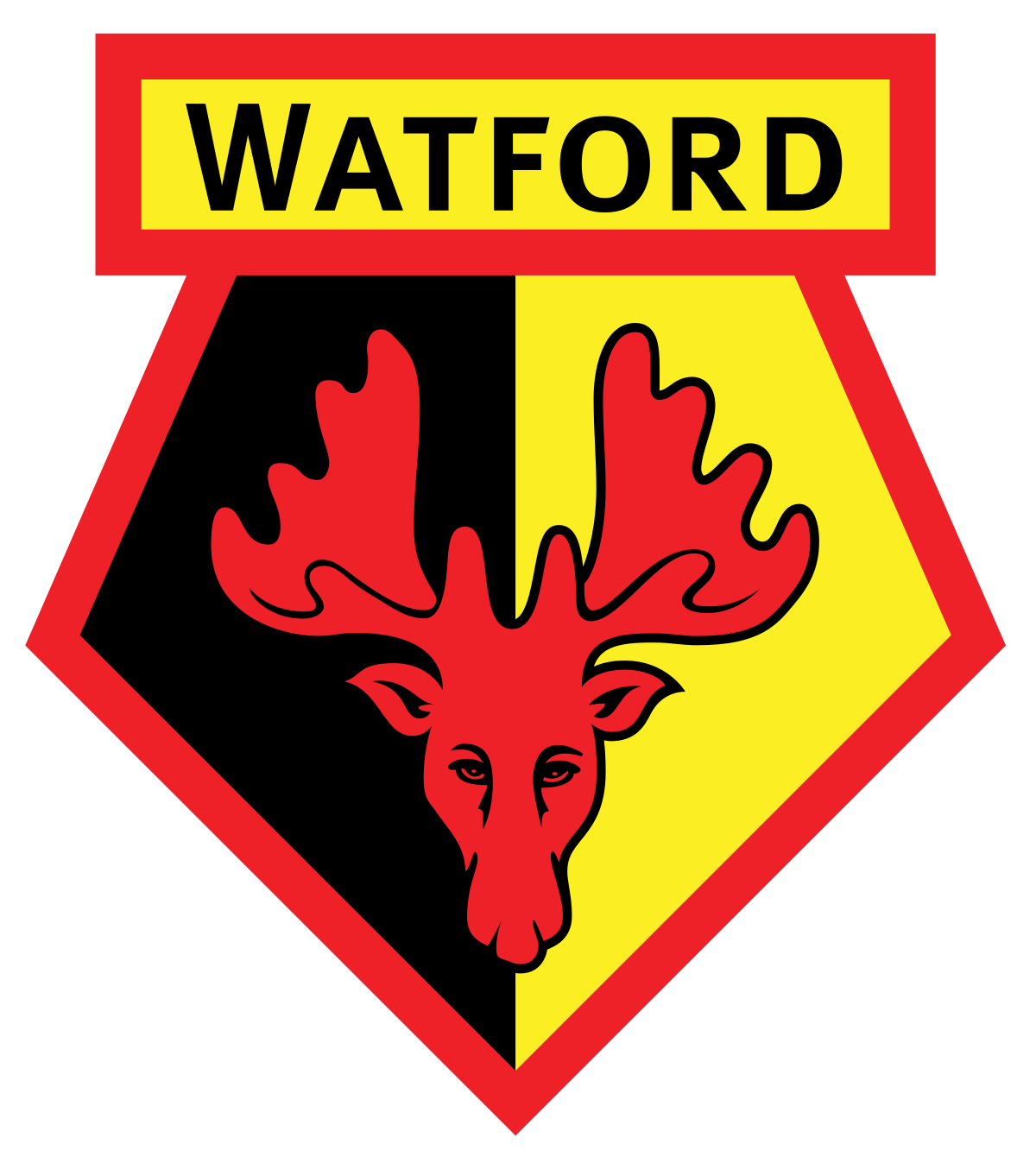
Watford's badge is pretty straight forward, there's nothing too wrong with it, except for the fact that it has a hart on the front - a nod to their Hertfordshire roots - which looks like a sad moose, while the team itself is nicknamed The Hornets. Make up your mind.
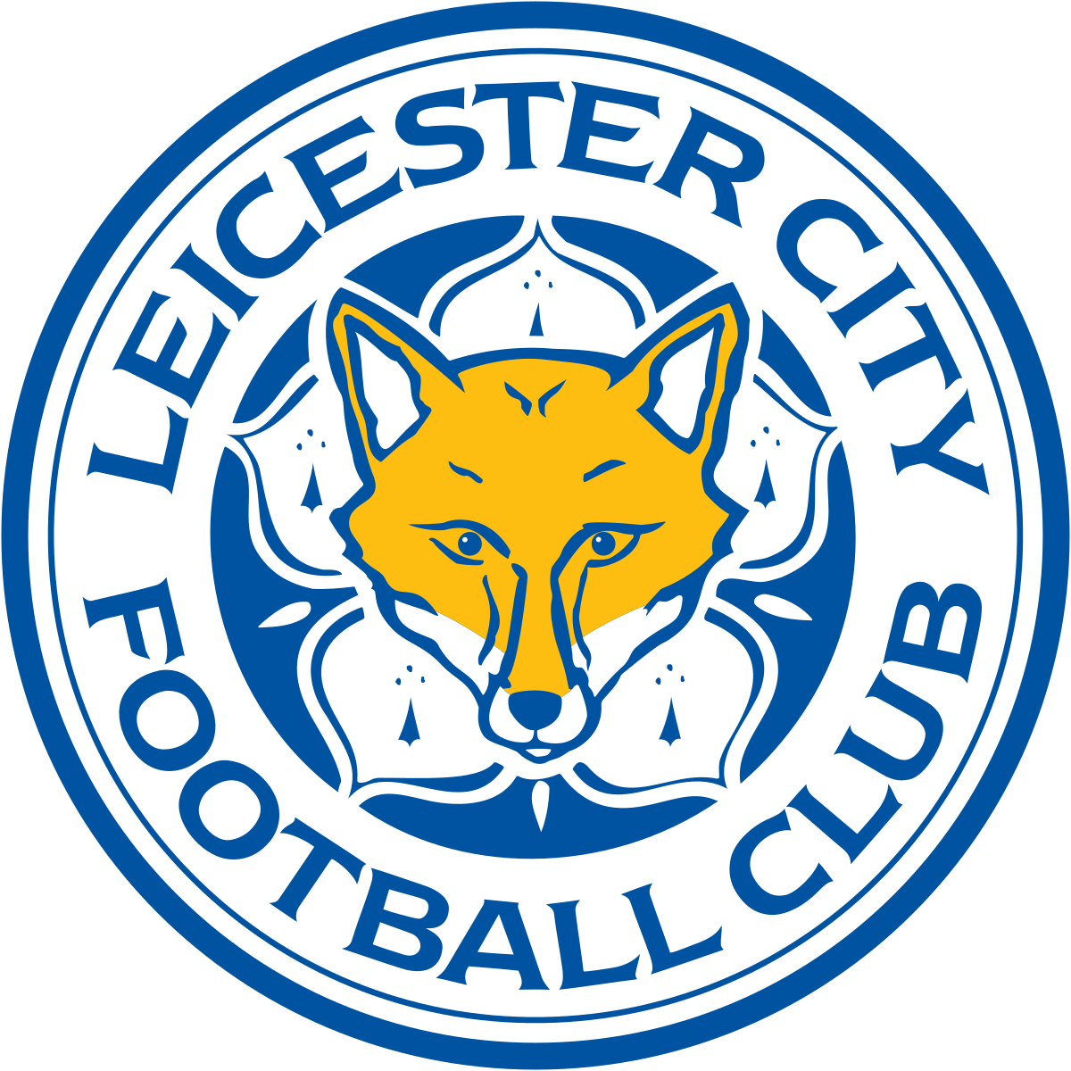
Leicester's badge does exactly what it says on the tin. They play in blue and white, they're called the foxes. What more do you need?
It's easy to criticise Man City for being too sanitised in the Sheikh Mansour era. And while at first glance this badge might look like the product of a thousand focus groups - and eerily similar to the NYCFC badge - it earns a lot of points back for being a modernised version of the old badge they wore between 1972 and 1995. Its historic value saves it from being further down the list.
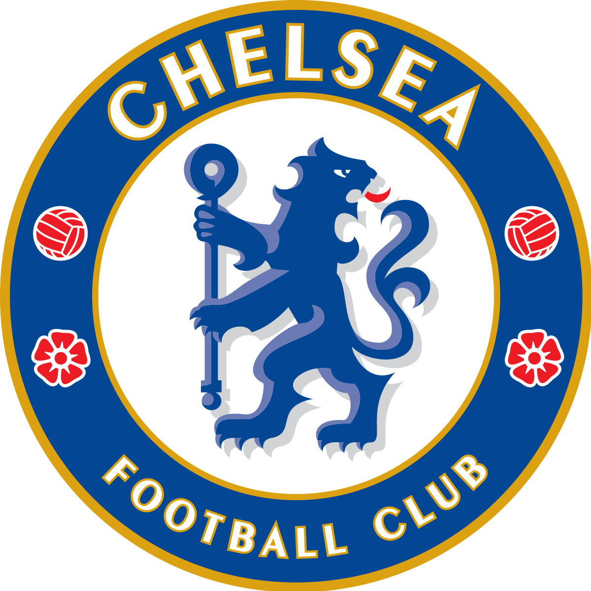
Similar to Man City's badge, it's a modern(ish) rebrand that added a splash of glamour to mark a new, super rich era in the club's history. The drops of red work nicely and tie in to their history of red trim on their home shirts, but I can't get past the lion in the middle looking like it's broken its neck. Why is he looking that way? Why?
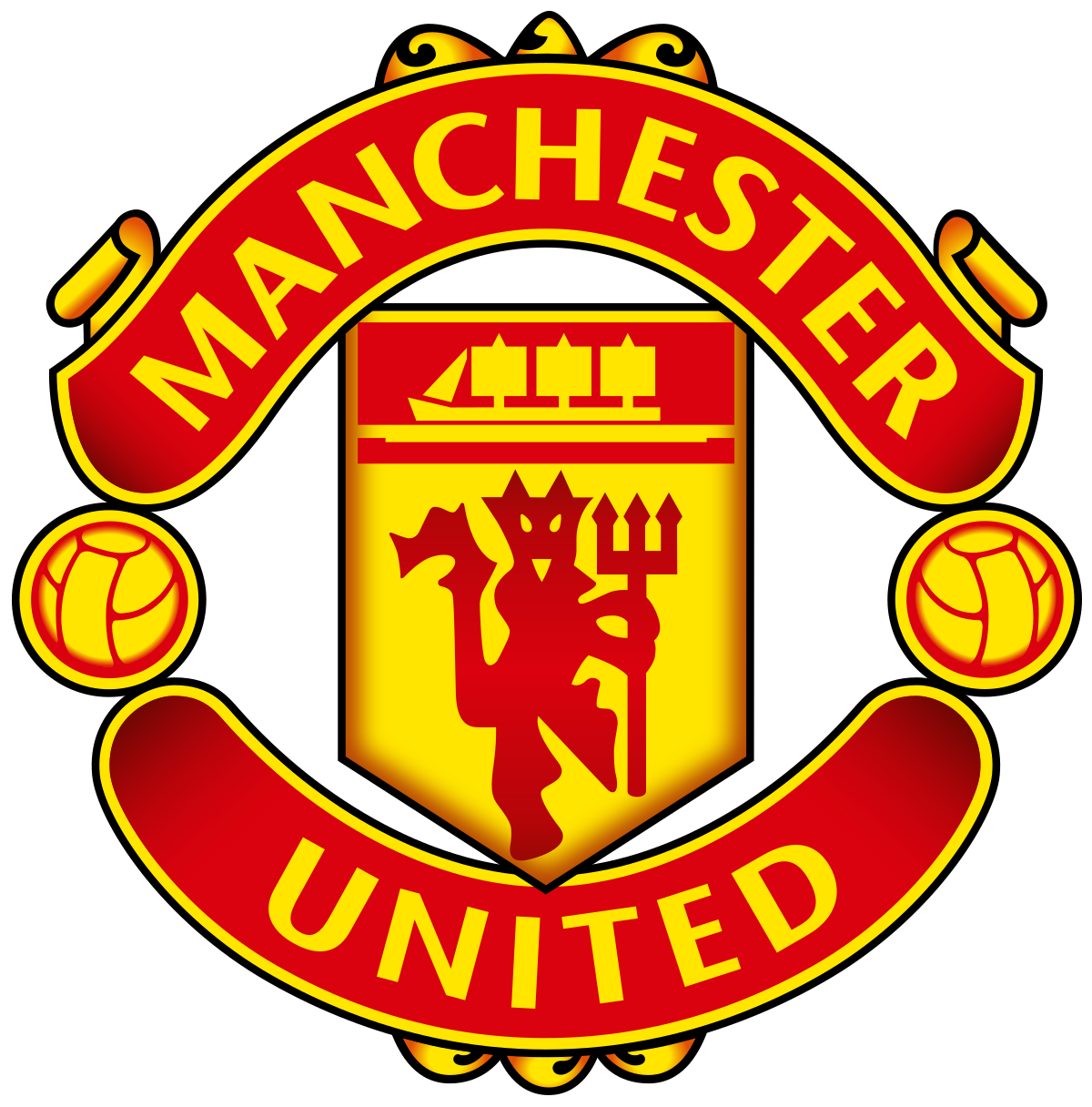
On last year's rankings, my colleague Wayne Farry put the Man United badge far too low down the list in 18th–and he's a United fan. But I don't agree with his scathing assessment that it's too simple. Very few clubs use the circular two-banners-and-a-shield format for their club crest. The colours work, the devil actually reflects their nickname (cough, Watford), and it looks even better with a retro style shield behind it, as seen in 06/07 and 19/20.
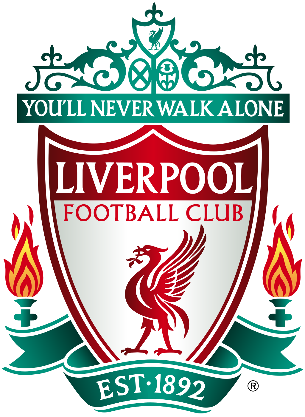
The latest of many iterations of Liverpool's iconic crest ticks a lot of boxes. The liver bird, the symmetrical torches, the three-pronged shield, the iconic slogan and the Anfield gates all feature on this legendary crest. But what stops it being much higher up the list is that I can't help but prefer the much more minimalistic version, as seen on their actual jerseys. Still, I guess having two different official crests is pretty cool.
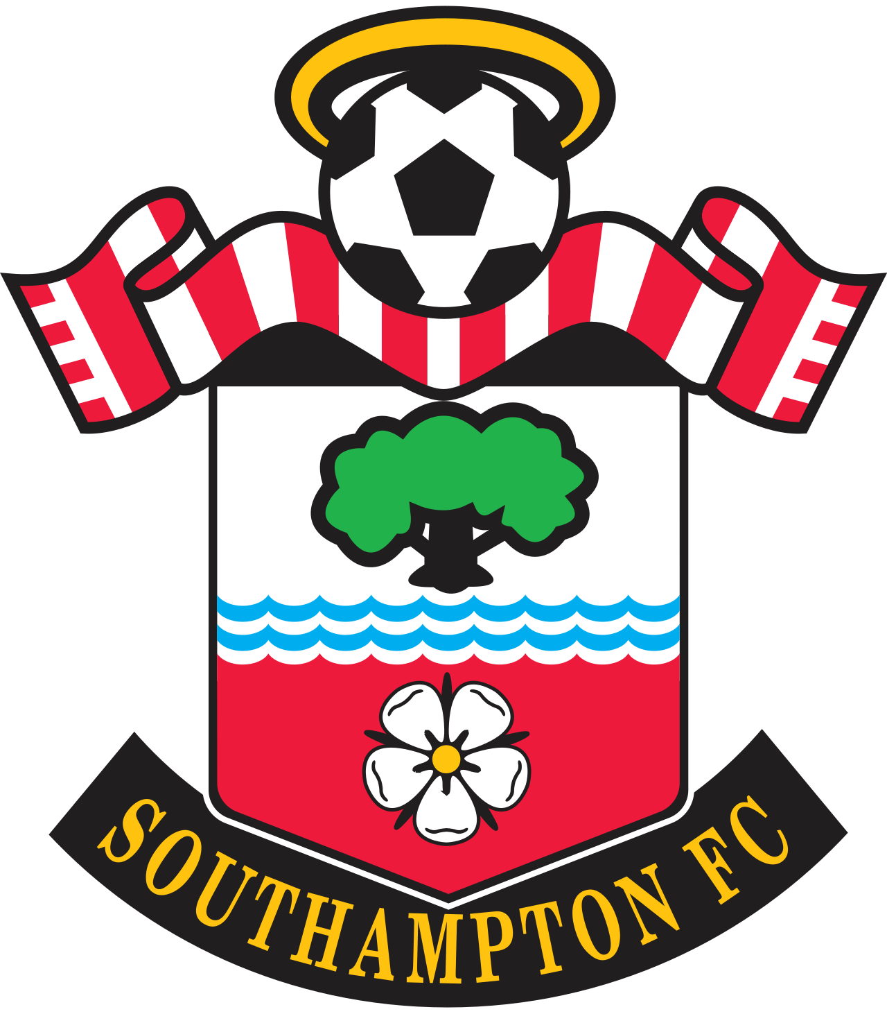
Now this is a fucking crest. It's a bit cartoony, especially the stock image football at the top, but everything else about it is spot on. Maybe it's the perfect symmetry, maybe it's the halo that sits atop the ball. Looking at it, you get the sense that if you asked someone to create an entirely new badge for a fictional football team, the end result would look something like this. Everything about it just works.
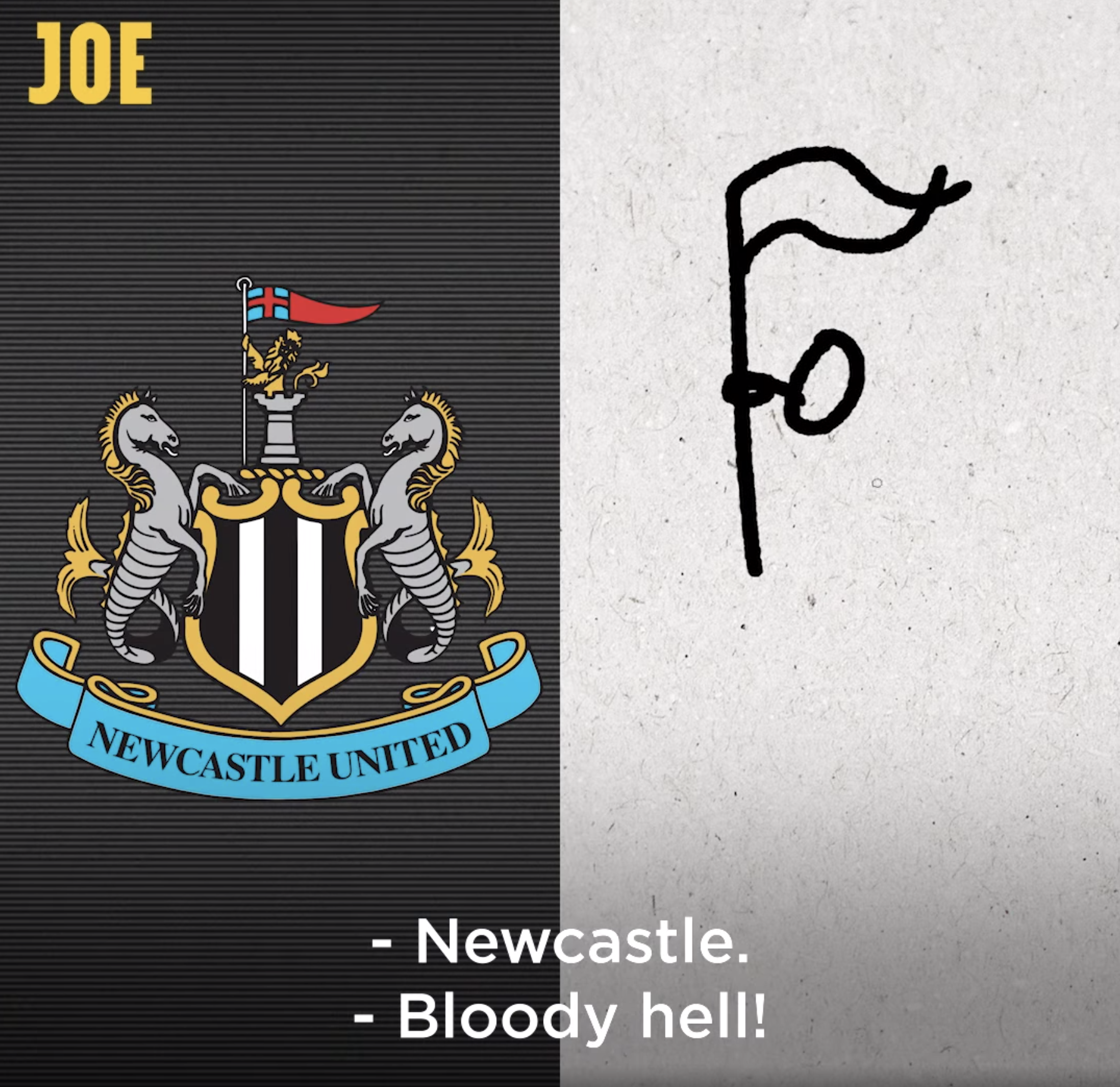
This badge still haunts me a little bit from the time we filmed a
last year and the aforementioned Wayne guessed it from just the flag at the top. I mean...
However, like Southampton, it does have all the hallmarks of a great crest. It's busy, but not too busy. The seahorses give it a coastal flavour, and the blue banner at the bottom brings some much needed vibrancy to an otherwise quite bland colour scheme. Excellent stuff.
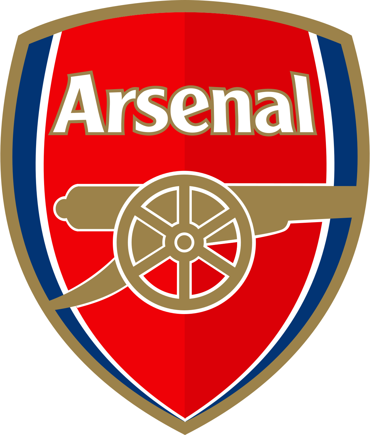
There is very little to criticise about Arsenal's badge. The two different shades of red might jar some people, but it creates a 3D aspect rarely seen on other club crests. It's got a gold cannon on a rounded shield with a small helping of navy to bring it to life, what's not to like?
Older iterations of Everton's badge were passable, but they weren't great. But with reflection, getting rid of the yellow edges and re-introducing the latin slogan on the banner was a smart move. This is probably the best thing about Everton Football Club.
Absolutely no nonsense going on here. They're Brentford Football Club, they play in red and white, and they're called the bees (due to a very strange but ultimately charming instance of
in the stands). What more do you want to know?
Villa fans are in the early stages of grief at the moment, and for that they have my greatest sympathies. But at least they've got one of the best badges (and stadiums, as it goes) in the Premier League. Simple colours, the club's initials, and a lion with its face pointing in the right direction. Superb.
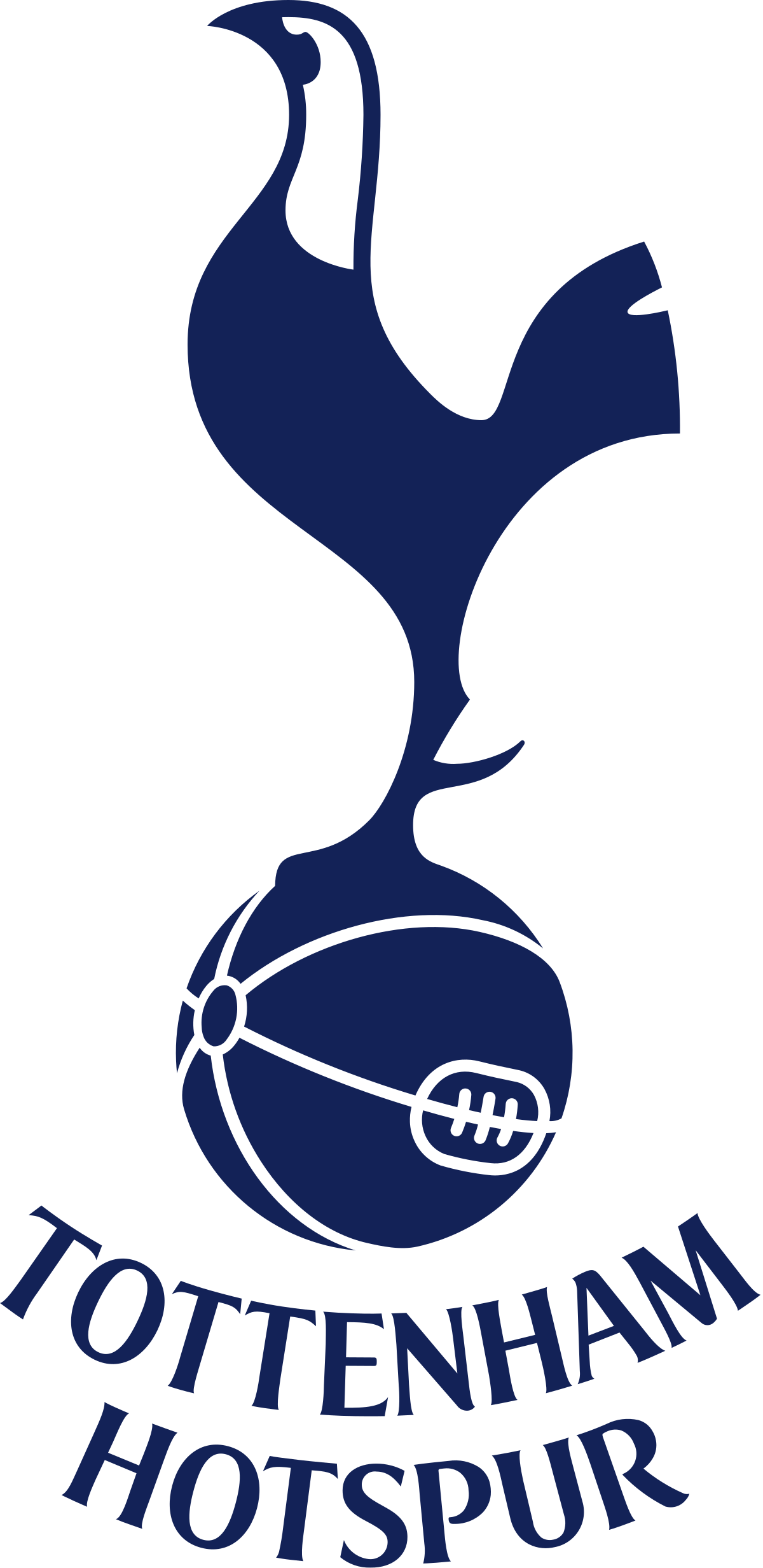
Have you seen the old Spurs badges? In the late '90s and early '00s? With all that yellow? And the feint colours? It was a badge so ugly, it wasn't worthy of a top flight club. Not even Spurs. But their current crest, with no shield, but simply a cockerel standing on an old football and the club's name underneath is minimalism at its best.
Yes, I'm a Palace fan, but you can shove your accusations of bias here. This beautiful crest was
on last year's rankings and was the only Premier League badge to be deemed 'elite' in a ranking
that I wasn't even in. It's therefore universally agreed that this badge is among the best around. Look at the eagle. Stunning.
I think I speak for everyone when I say thank God Leeds didn't follow through on their announcement to change their badge to this monstrosity below. If they had listened to whichever deranged focus group suggested it, it would have been one of the darkest days in the club's history. Worse than their relegation in 2004.
Thankfully, they actually listened to the backlash and stuck with the above, which was flawless to begin with. The typeface, the shape of the shield and the vibrant but not overpowering shades of yellow and blue combine to make the most aesthetically pleasing badge in the top flight. It also leans into the club's history before they began wearing all white, culminating in Leeds consistently having beautiful home shirts. After everything they've been through, they deserve this title at the very least.