There's only so much you can do with a white shirt
Designing an England shirt is no easy task, as demonstrated by some of the awful kits worn over the years (I'm thinking of Euro 2016 mainly, God they were awful.) But there have been some absolute belters over the years too, many of which hang on my bedroom wall with pride.
Here is the definitive ranking of every kit worn by England at major tournaments since Euro 2000, starting with the worst. (For what it's worth, the 2008 shirt would have been very low on the list, it was horrible.)
World Cup 2006 Away
This kit reminds me way too much of the third
Goal! movie, which we can all agree is the worst piece of cinema ever made. If you can even call it cinema. For that reason alone, this kit is bottom of the list.

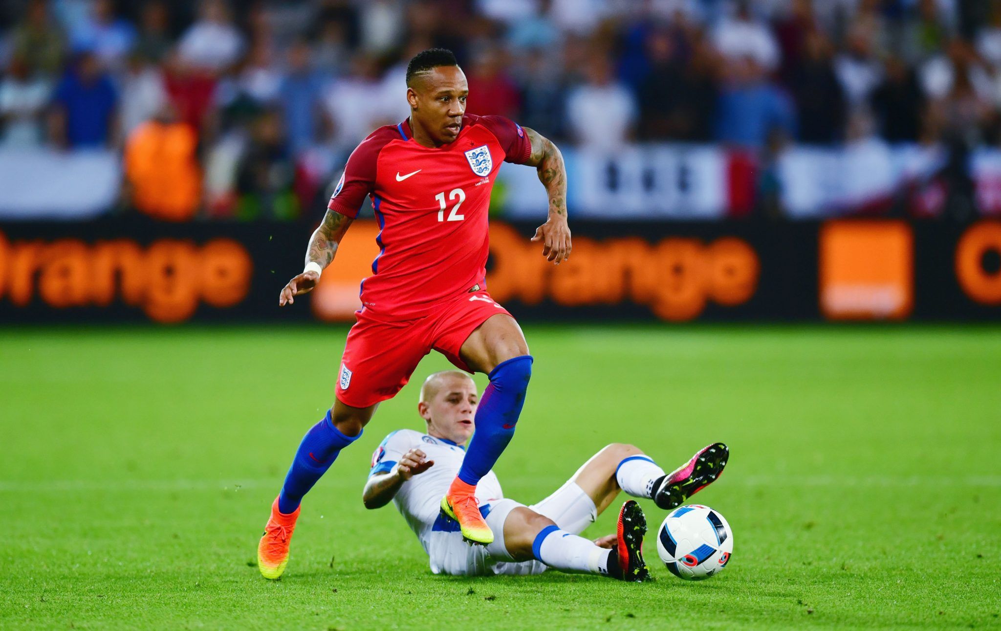
Euro 2016 Home
Obviously memories of wearing this kit are haunted by the ghost of Aron Gunnarsson's long throw, but aside from that it's just a horrible kit. The blue sleeves are complete unnecessary and ruin what could have been a passable shirt, but they're far from the worst thing about the kit as a whole. The socks. The fucking socks. What were they thinking? There is an unwritten rule with football kits: you can't have a light shirt, light shorts and darker socks. It makes you look naked. Remember when Real Madrid had to wear black socks at Stamford Bridge recently? They deserved to be eliminated before the second leg had even kicked off.

Euro 2016 Away
A marginally less bad version of the kit above but still not great. 2016 was a bad year.
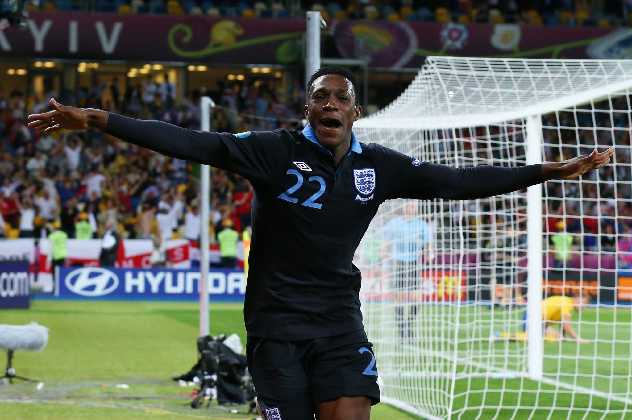
Euro 2012 Home
Much like the side that played in the tournament, there is absolutely nothing notable about the kit England wore at Euro 2012.
[caption id="attachment_277595" align="alignnone" width="1883"]
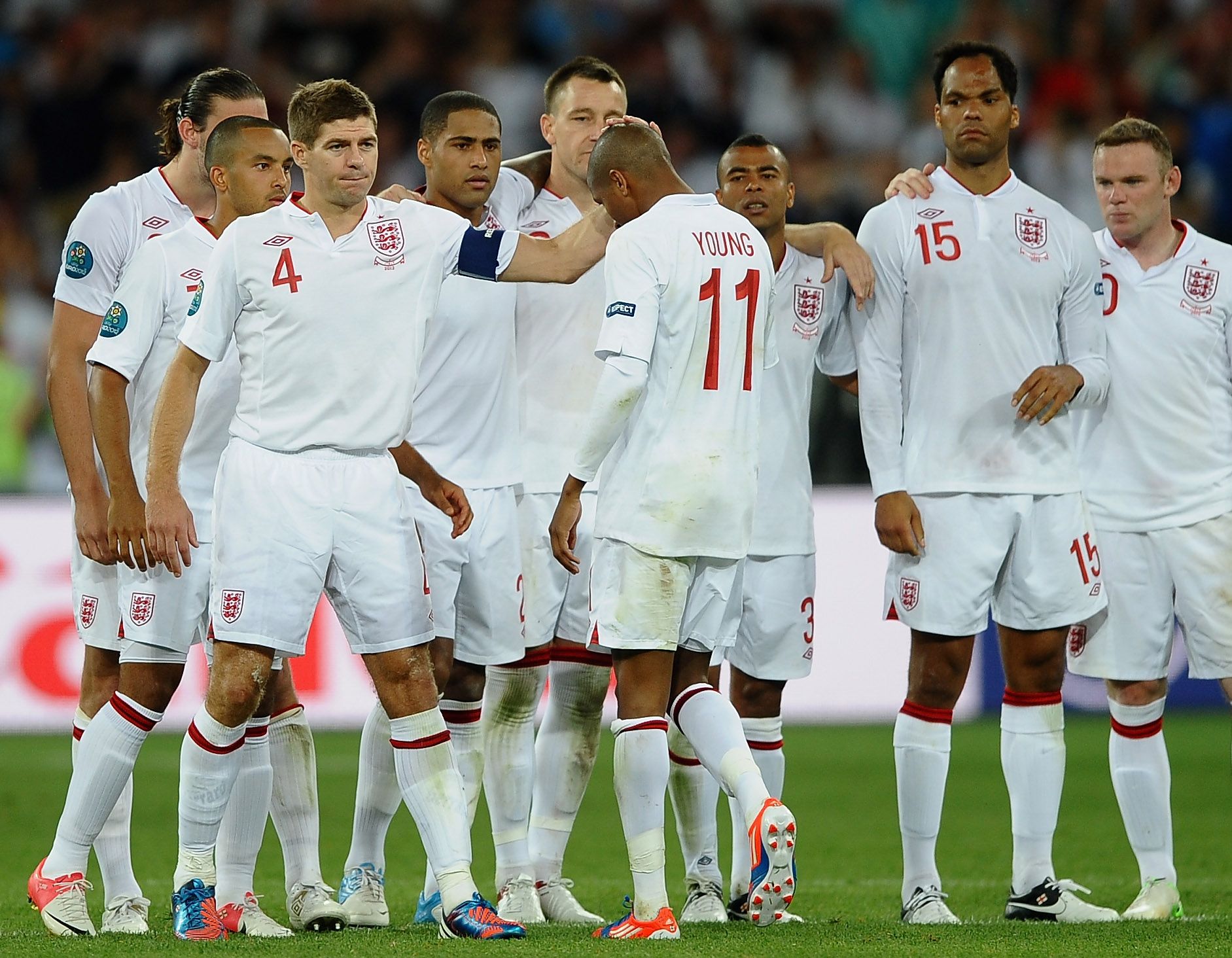
KIEV, UKRAINE - JUNE 24: Steven Gerrard of England consoles Ashley Young after missing his penalty during the UEFA EURO 2012 quarter final match between England and Italy at The Olympic Stadium on June 24, 2012 in Kiev, Ukraine. (Photo by Laurence Griffiths/Getty Images)[/caption]
World Cup 2010 Home
Pulling off the 'smart casual' football shirt is tricky. A collar can lift a jersey from a 6 to a 9 but the font on the lettering for the 2010 World Cup shirt lets it down a bit. The all-white colourway was also jarring. Navy shorts, always. It's not that hard.
World Cup 2010 Away
Again, like most England kits it brings back haunting memories of the goal that never was, but there's nothing too wrong with this jersey. One slightly jarring detail, though, is the fact that the number on the front is not in the same position as it is on the home kit. Some consistency, Umbro, please.
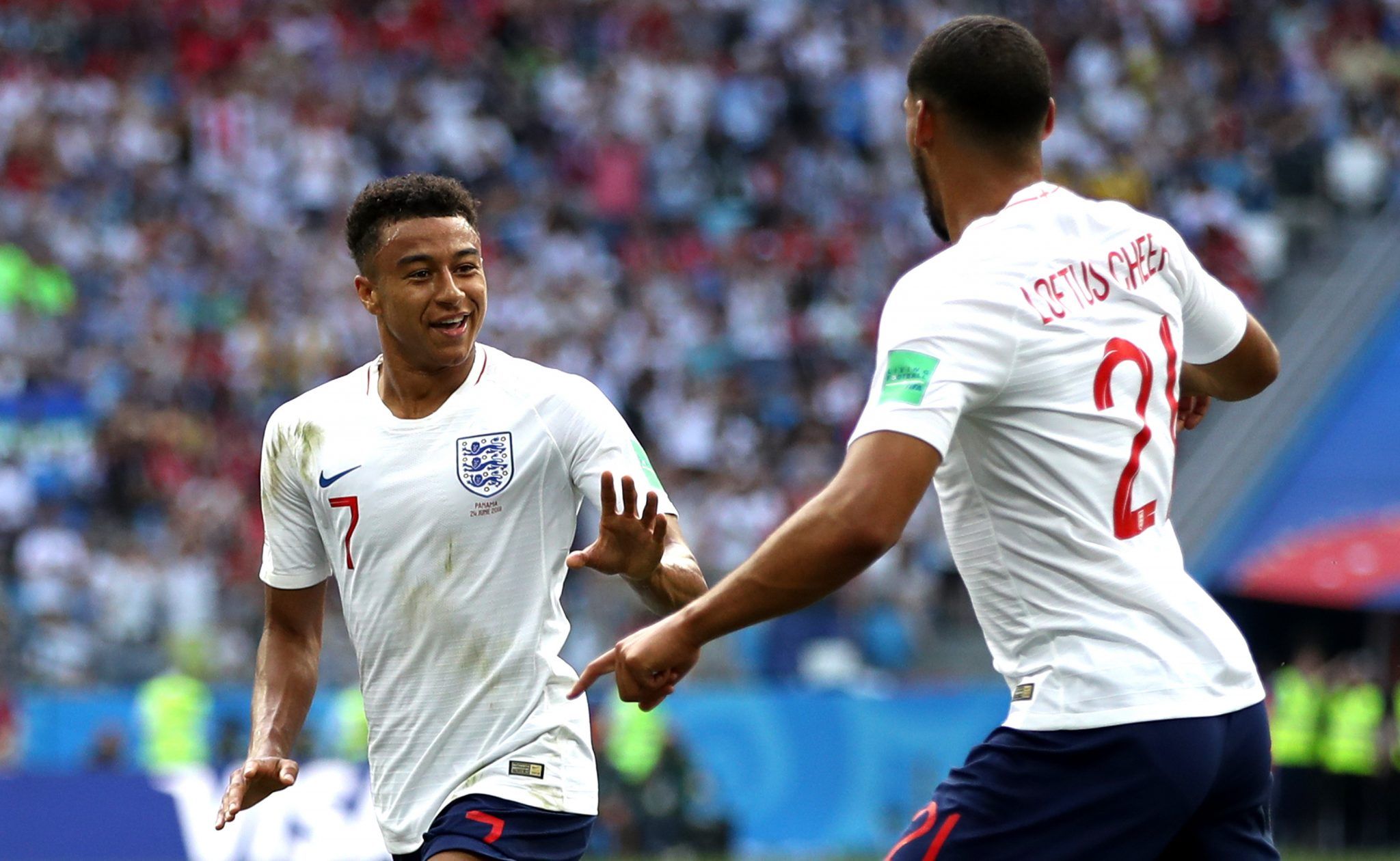
World Cup 2018 Away
One of the few England strips that actually brings back joyous memories; the last minute limbs against Tunisia, the penalty shoot-out against Colombia, and (as pictured below) that easy 2-0 win over Sweden. If only we'd worn it for the Croatia game.
In terms of its aesthetics, it's clean, not too busy, and the Nike template doesn't burst out too much due to the careful blending of the different shades of red. A good shirt on the whole.

World Cup 2014 home
Not enough red on this one for me, Clive. For some reason though, the white shorts don't annoy me as much.

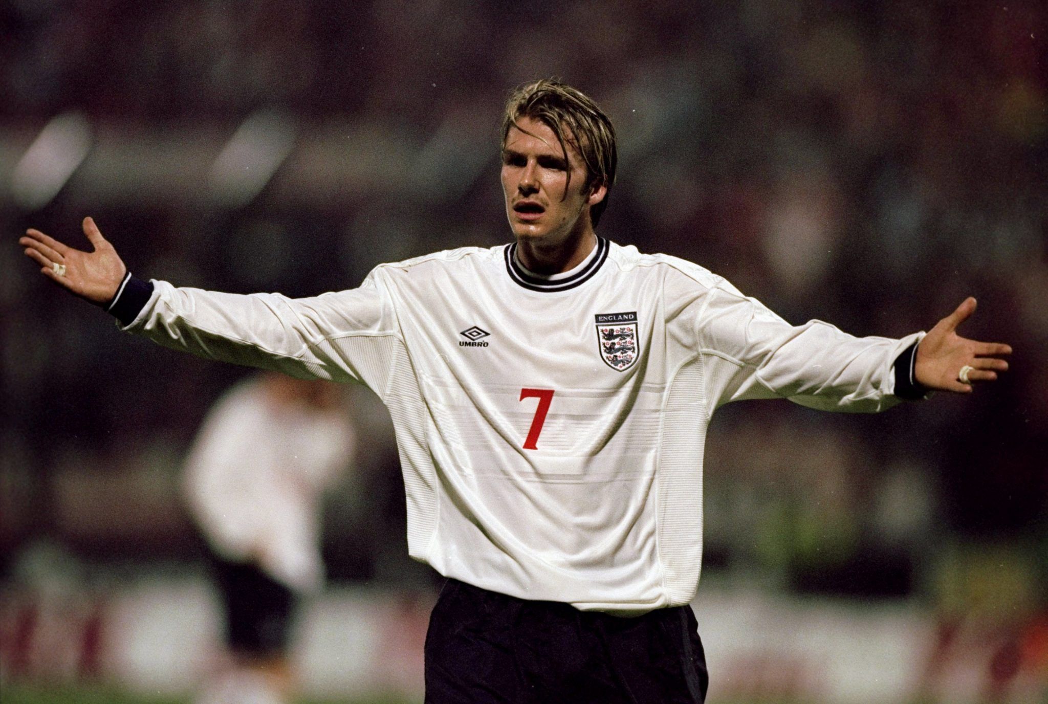
Euro 2000 Away
Dangerously close to resembling a rugby shirt, this one. But the retro Umbro logo, the font and David Beckham's buzz cut look make it passable. Just look at him. Fuck.
Euro 2000 Home
Becks must have had a haircut mid-group stage during this tournament, but he looks beautiful either way.
The crewneck on this one adds a little dash of flavour to an otherwise plain shirt, as do the red numbers. Thankfully I'm too young to remember Phil Neville's gaffe against Romania, so no haunting memories with this one.
World Cup 2014 Away
It's a shame this one never got a showing at yet another disappointingly short spell at a tournament. But it's a strong jersey, and the white shorts give it some character.
World Cup 2018 Home
The red lettering, the navy shorts, the little red line around the neck. Fucking hell, what a shirt. What a summer.
Euro 2012 Away
A blue England shirt always ruffles a few feathers with the sartorial purists who think the away shirt always has to be red. But this one was a stone cold stunner. The colour combination, complemented by the crest, is a winning combination. Plus, Danny Welbeck scored that back-heel volley while wearing it. This was one of the best jerseys in recent years.
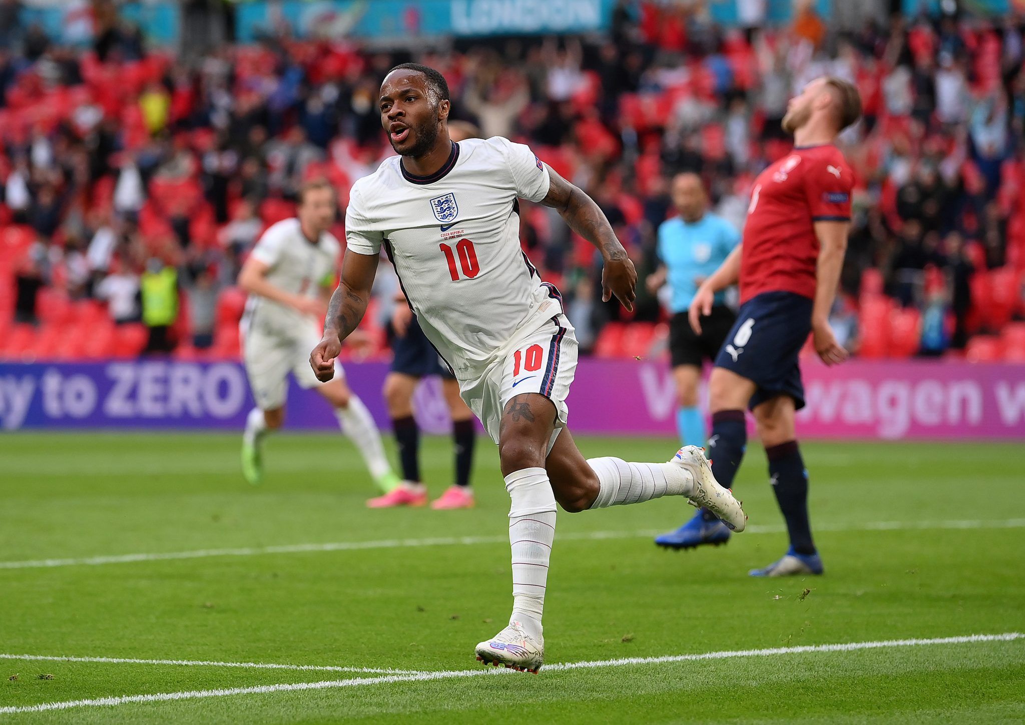
Euro 2020 Away
Another blue number, another absolute beauty, only slightly let down by the red on the crest. Make that white and it would probably surge to the top of the list. Plus, anything looks good on Jack Grealish.

Euro 2020 Home
Fusing old school with the new is not an original idea. Plenty of kit manufacturers have harked back to the glory days of whichever club they sponsor, basing modern kits on an old favourite. And why wouldn't you lean into nostalgia? If there's one thing football fans love - especially in England - it's longing for times gone by with rose tinted glasses.
With this one, you can see Nike have taken inspiration from the Umbro number that the team wore in 1998; the font and colour of the names and numbers, the central crest, the navy collar. It's all there, but they've made it look modern. Centralising everything on the front also means the rest of the shirt isn't too busy. It does look better with navy shorts, though. Obviously.
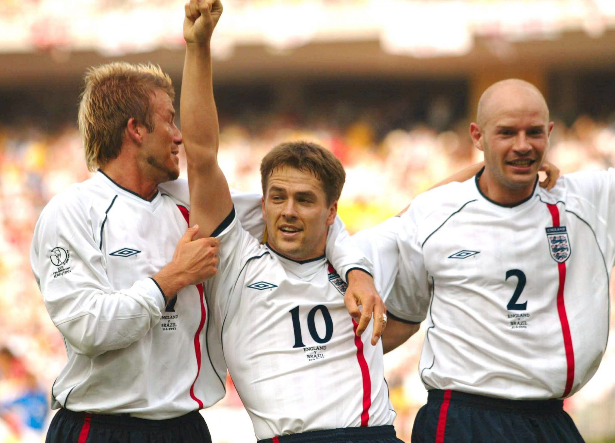
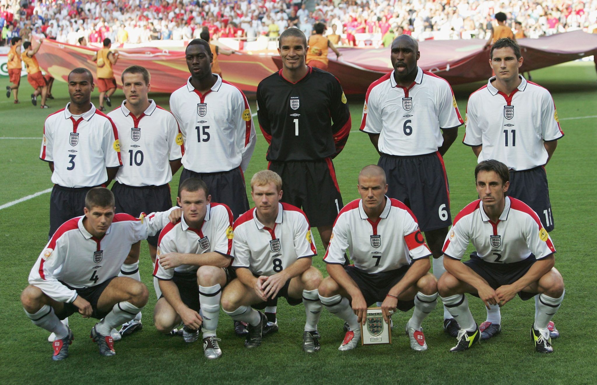
World Cup 2002 Home
My grandma once bought me this shirt for Christmas, and then again for my birthday. But you know what? I didn't care. I was thrilled, in fact. This shirt is so beautiful, why wouldn't you want two?
Whichever Umbro creative's idea it was to slap one red stripe on an otherwise plain jersey is a genius as far as I'm concerned. bring it back for 2022.
World Cup 2002 Away
There are plenty of reasons to love this shirt. The 1-0 win over Argentina, mainly. The sight of Beckham wheeling away in celebration, pulling the shirt almost straight off his torso in celebration, lives long in the memory, as he exorcised his demons from 1998.
But objectively, it's also an aesthetically beautiful top. The scarlet red colourway, and the subtle detail of the St George's cross stitched into the cuffs and collar, lift this kit right into the Champions League places within this ranking system.

World Cup 2006 home
There's not too much going on here, but it's got a big old St George's cross on the shoulder, and a little collar. That's all you need in an England shirt. Simply stunning. Bravo.
Euro 2004 Home
I'm an absolute sucker for centralised badges. I also love a collar. This Euro 2004 kit has both, with the addition of some lovely red strips on the sleeve that really bring it to life. This kit deserved more than being cheated out of a quarter-final against Portugal. So much better.
Euro 2004 Away
This kit was slightly left-field, with the silver lettering. But it's the crosses on the shoulders that put it top of the list for me, Clive.
I've never been so excited to open a present than when I was given this shirt with '9 Rooney' on the back after his masterclass against Croatia.
If we ever see an England kit this good again, we will be very lucky.