It certainly makes the 'kissing the badge' celebration difficult
Designing a football shirt is no easy task. Every season, the manufacturers need to design three (sometimes four) shirts that are different to the designs worn the previous year, and invariably they still get criticised by a large portion of supporters.
Ahead of this season, Puma learned this lesson the hard way when they revealed that 11 of their clubs would be wearing third kits with a new, controversial twist.
One by one, the kits were unveiled showing the team's name in big letters between two horizontal lines on the front, with a sublimated pattern of the team's crest.
Essentially, they brought out kits that - for the first time - actually had no badge.
So, with the dust now settled and people relatively acceptant of the designs, we decided to rank each and every Puma third shirt from the 2021/2022 campaign from worst to least bad.
Let's get into this.
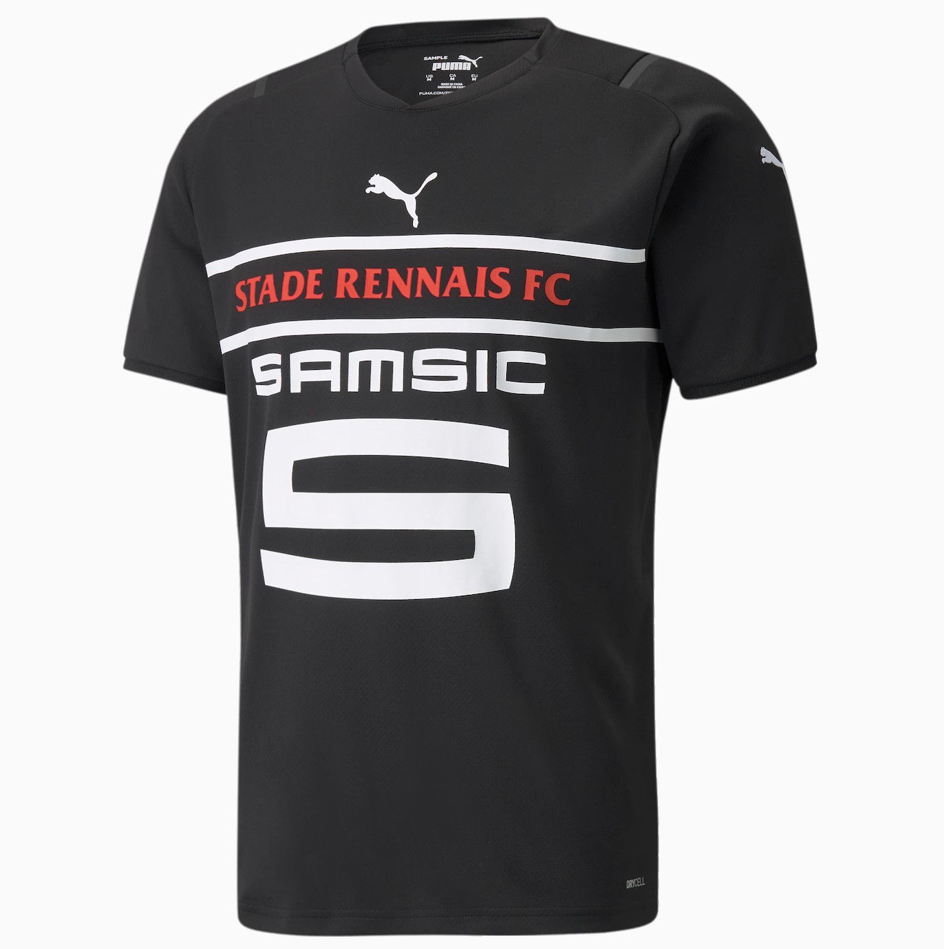
Stade Rennais
The problem with this shirt is obvious, isn't it? The sponsor. It is now a burning desire of mine to find out why the 'S' is so big, there is surely no need for it to be
that big. It's unfortunate because the shirt itself - in terms of the colour combination - isn't actually too bad. Yet, the sponsor simply cannot be ignored and, unlike with some other Puma third shirts, there is no sight of the badge anywhere on the jersey - not even a "let's copy and paste a bunch of badges onto the shirt so when people claim there's no badge, we can say 'well, yes there is'." So, for the sponsor alone, this kit is bottom of the list.
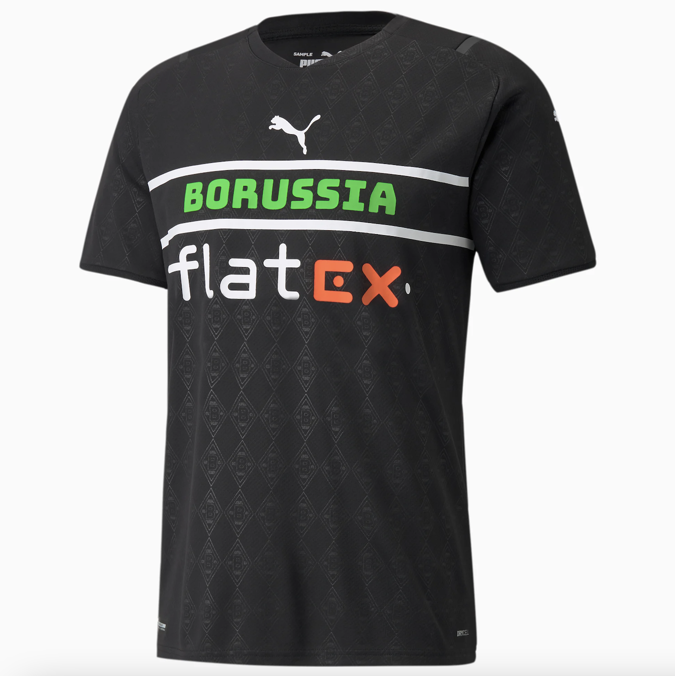
Borussia Mönchengladbach
Unlike the above, this kit gets points for featuring the Mönchengladbach badge in the background of the shirt. However, there are still serious issues with it. Firstly, the colour clash - there are four colours involved with this shirt and they certainly aren't working well together. While I appreciate that black, green and white all are connected with the club in some way, the orange on the sponsor does not fit in well at all.
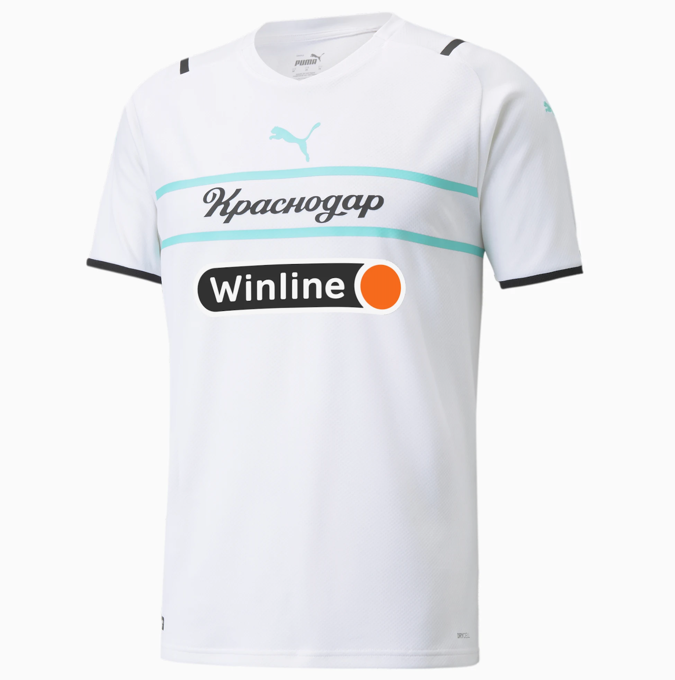
Krasnodar
This shirt has got some decent aspects to it, the white is evidently a plus because, well, all white shirts are beautiful.
I strangely quite like the turquoise element to the design as well. The problem, though, once again sits with the sponsor. At first glance, I thought it was photoshopped onto the jersey–it strangely doesn't even look like it's part of the shirt.
It's not the worst shirt on this list, it just isn't anywhere near the best.
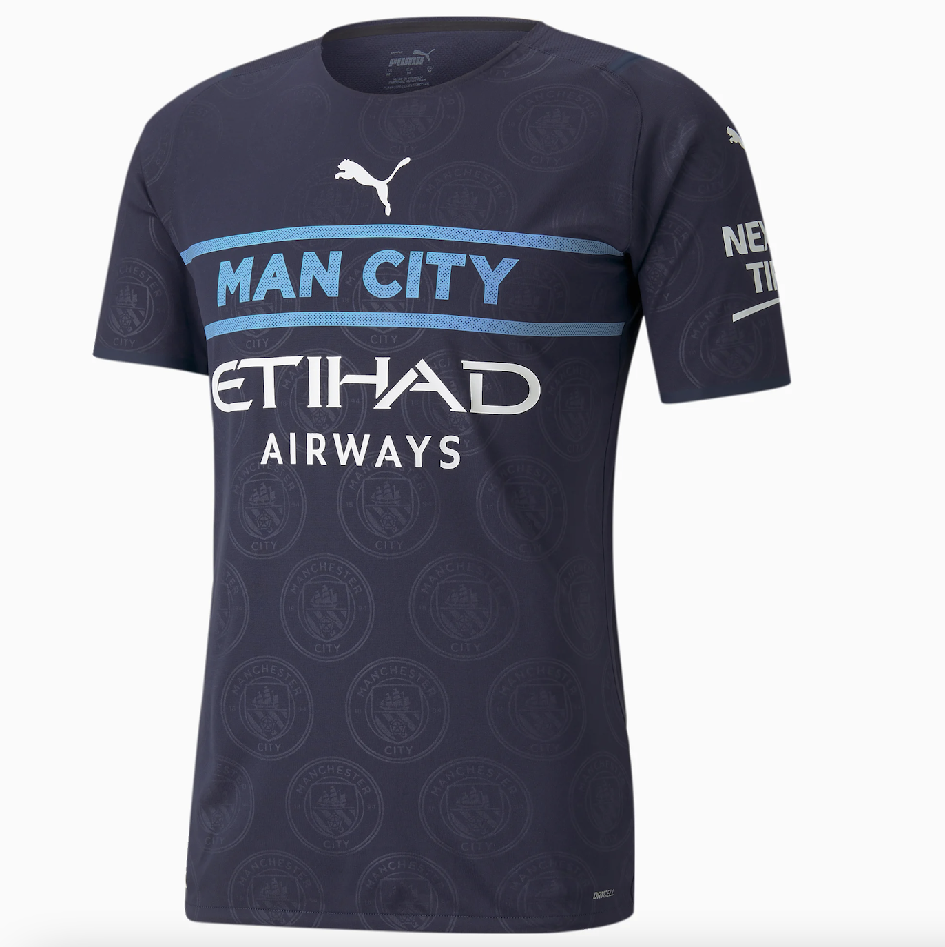
Manchester City
For the first time on this list, I actually don't mind the sponsor on this shirt. The colour works well with the Puma badge and sleeve sponsor, so Puma and City get points for that.
As well as that, the fading badges throughout the front of the jersey actually look alright. However, the way it says 'Man City' rather than 'Manchester City' is slightly irritating - I know that they're widely known as Man City, but it is still technically not their name.
It just looks a bit too much like a pyjama top, not a football shirt.
Fenerbahçe S.K.
It is important to state that there is a lot to like about this shirt. Unlike the other jerseys so far, the decision to make the stripes on the shoulders the same colour as the club name and middle stripes is a good one - it is just simple synergy that the other kits didn't quite grasp.
Much like the City shirt, the fading badges are a nice touch and the sponsor, well, it's certainly not great, but we've definitely seen worse.
The colour combination used deserves recognition, too. Like with many of these shirts, it's not terrible, but it's just not that great either.

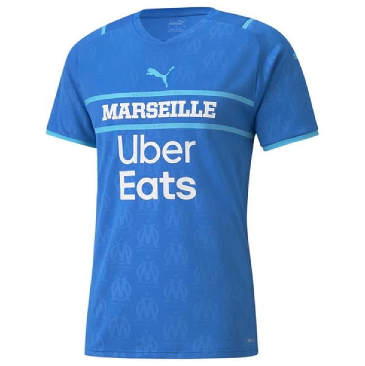
Olympique de Marseille
It really was a tough call between this one and Fenerbahçe's. It's starting to get to a point where the jerseys are growing on me. Considering it's the main talking point of every jersey, let's address the sponsor first.
It's spread across two lines, which is a bit jarring, and the fonts aren't great either. Yet, for some mad reason, it still works.
Maybe it's the font used for 'MARSEILLE' - it looks so smart and powerful (if a font can look powerful? I don't know at this point).
Having blue-on-blue was a risky call, but again, it works. There's a nice contrast and the added element of the white lettering only helps this shirt's case. This shirt finds itself firmly in mid-table.
PSV Eindhoven
PSV are a classy club, and this is a classy kit. The colour of the jersey will divide opinion - mint green isn't for everyone. As much as anything, it's the simplicity of the design. The fact it says 'PSV' is strangely satisfying, as, obviously, that is literally the name of their club, but it just looks so tidy. I'd be lying if I said I knew anything about their sponsor, but the fact the word 'Eindhoven' is part of it is all I need to know - synergy guys, it's all about synergy. It's a kit made for a club who will inevitably finish 2nd behind Ajax.
Overall, it's a shirt you'd be happy wearing to 5-a-side, and one where you'd pull out the Carlos Vinícius scores-tap-in-against-non-league-club celebration (yes, he DOES play for PSV these days).

Shakhtar Donetsk
I have to be honest with you, this shirt is placed so highly purely because I cannot be sure whether or not it has a sponsor on the
real kit, on the image - taken from the official PUMA site - it clearly doesn't, but after a Google search, some pictures show it having a sponsor - and an ugly-looking one at that. However, because the picture below doesn't, we'll pretend it doesn't. It's just so simple, but so beautiful. As previously discussed, white shirts will always be given a couple of extra bonus points, but shirts with a black and white combination - like this one - are even better. It's like chalk and cheese or pot and kettle, they just work.
The orange lettering is stunning, too. Why does it look so good? I really don't know. Is it the black outline on the letters? Most probably. Everything about this shirt is good, there's really not anything wrong with it. The reason it comes in fourth, then, is simply because I can't be sure about the sponsor situation - am I simply being naive?

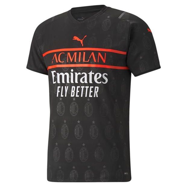
A.C. Milan
Just imagine Zlatan Ibrahimović scoring a bicycle kick in this shirt. Imagine those scenes. I'm not going to bother moaning about the 'FLY BETTER' slogan because it doesn't deserve the time of day - I'll fly how I want, thanks. With the only negative out of the way, can we appreciate how gorgeous this shirt is, like, REALLY appreciate it. I love how they've got the full name of the club on the shirt and even better, in the same colour as the PUMA badge. The fading badge appears to be quite prominent on this shirt and it's a feature I like, most likely because the AC Milan badge is, for me, one of the greatest in the history of the game.
Whilst I can't imagine Paolo Maldini donning this shirt, I can picture David Beckham in it. Becks would love great in this.
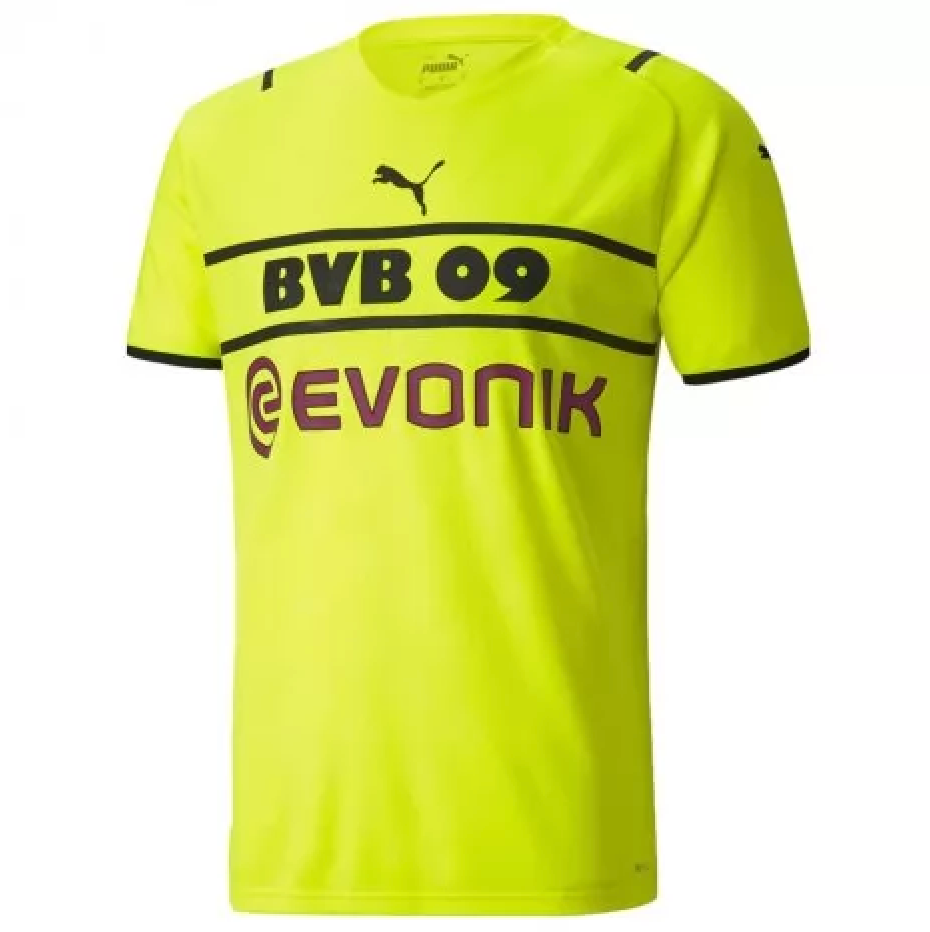
Borussia Dortmund
Before anyone says anything, YES, I am aware that, following fan complaints, Dortmund have actually added their badge to this shirt. However, to be completely fair in all of my rankings (if that's even a thing), I will be judging this shirt as it was originally designed.
This might come across as quite controversial, maybe even hypocritical considering how I judged earlier jerseys, but I actually like the fact it says 'BVB 09' - it's a simple, but effective, nod to the club's history and - unlike Borussia Mönchengladbach - it's a cool way of adapting to the fact that there isn't enough room for 'Borussia Dortmund' on the front. The colour is beautiful and I like the fact it's a slightly different shade of yellow to their home shirt. It's a third kit, remember - they can be different. I actually quite like the sponsor, too. You may question why, and the answer to that it 'I don't know' - it just works. I can picture Erling Haaland scoring a goal and just looking absolutely boss in this kit. Why? Again, I don't know. What I do know is that if, for someone reason, you're looking for a shirt with no badge (well, sort of), you will struggle to find many nicer than this.
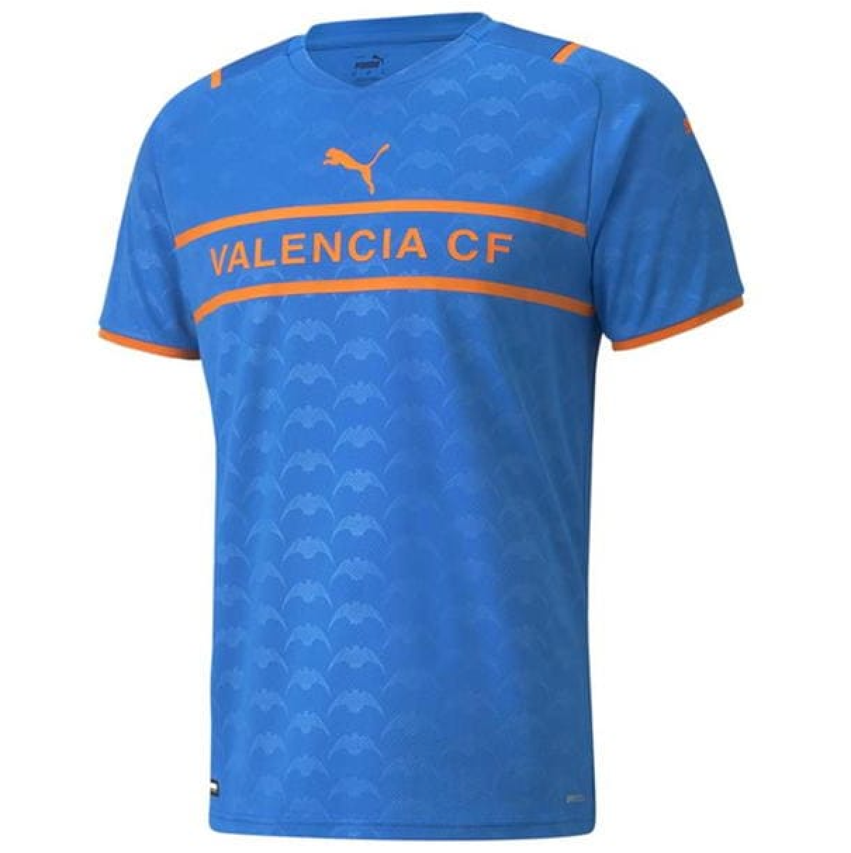
Valencia
Just look at it. Look at it and tell me - even if you're the biggest hater of no-badge shirts - that this isn't a thing of absolute beauty. Like the PSV shirt, they have used two colours - this is good because, as you know, synergy is important. However, where this shirt excels is in the specific colour combination used. It is spectacular. I had no idea that blue and orange would work so well, but it really does. The main reason that this top sits right at the very top of these rankings is because of the fading bats on the shirt, they add a completely different element to the shirt that the other jerseys failed to master. The bat is important in Valencia as it is viewed as a symbol of victory. Fittingly, the bat has played a significant part in this shirt securing victory in the 2021/22 Puma third kit rankings.