


Sport
Share
Published 14:14 24 Aug 2016 BST
Updated 14:30 11 Apr 2017 BST

 What is this? It looks more like a Pantene advert than the crest of a Premier League football club. Also that header is only going to go backwards – the person in this badge is scoring an own goal, which is appropriate, because that’s what the badge itself is.
 So what it looks like has happened here is that Burnley have taken one crest, and then put that crest inside another crest to create some weird Russian doll-type job. Why are there so many animals? What are those bees doing there? Why is there a lion trapped under some stairs? Nightmare.
 There’s nothing really wrong with Stoke’s badge at all, it’s just a bit boring isn’t it? They could have at least put a pot on it. Or a picture of Stanley Matthews’ face.
 In the words of Mr. Peter Ian Staker from Hot Fuzz: “I mean, it’s a swan.”
 This is actually a pretty nice badge, but it only exists because of Assem Allam’s desire to commercialise Hull City (remember the whole Hull Tigers thing?). Because of that, this badge loses points.
 Why the fuck is there a moose on it? That moose is definitely lost. Someone should probably report it or something.
 The crest bit in the middle looks like a seven-year-old’s tried to do a jigsaw and got it all a little bit wrong. The lions also look a bit like they’re crying in pain, probably because they’ve spent their entire lives watching Sunderland play football.
 The whole “London” thing is pretty tacky and definitely seems to be focused towards bringing more tourists to the club. With this and the fancy new squeaky clean Olympic Stadium too, the Hammers are in danger of losing some of their old east London identity.
 Better than their old logo, which for some reason was a deeply distressed-looking eagle with a crest for a body, but we all know it’s only been changed so that Man City, New York City and Melbourne City’s crests all look basically the same.
 It’s weird that so many English football clubs have lions on their logos when there are no lions in England, isn’t it? Anyway, this badge is alright.
 Smart logo, good colours – this is a solid mid-table finish for Leicester – which is probably a bit of a disappointment to their fans these days.
 That lion’s definitely got a broken neck, hasn’t it? Either way it’s a good logo – much better than the weird car crash they had under Ken Bates.
 It’s got an eagle on it, and it’s got the actual Crystal Palace too, so that’s two big fat ticks right there. Hopefully the badge isn’t drawn to scale though, because otherwise that eagle is fucking terrifying.
 Manchester United’s crest is iconic mostly because of the fact it belongs to Manchester United, but also I’m pretty sure it’s the only football club badge in the world to have a devil on it. This is not something I’ve actually bothered to check though, so you can shout at me if I’m wrong.
 The bird on West Brom’s badge is a throstle, which doesn’t sound like a real thing, but I am assured does actually exist. Back in the ‘30s, the club used to have one of the birds sitting in a cage on the touchline, and it was said it would only sing when the Baggies were winning. The thing it’s sitting on is a hawthorn branch, after the name of the stadium, so all in all this badge makes a lot of sense.
 With the Spurs logo I always kind of feel like it doesn’t need the name of the club underneath. Otherwise it’s pretty perfect – it’s got that retro feel while still looking clean and modern. It’s an excellent navy too.
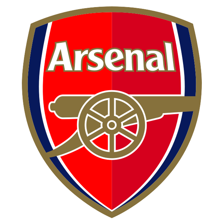 Because Arsenal always finish fourth – and always finish above Tottenham. It is a good badge though – it’s strong and simple without being boring.
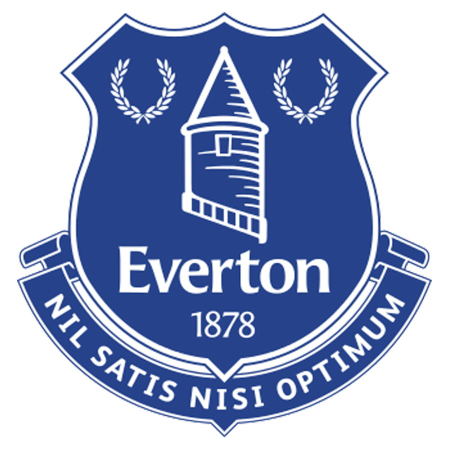 Thank fuck they changed that absolute shocker from 2013 after just one season, because this new one is a beauty. That tower on it is actually tiny in real life – it’s called Prince Rupert’s Tower and sits at the heart of the Everton district of Liverpool. The Latin motto at the bottom means “nothing but the best is good enough”, which is odd since they regularly finish mid-table.
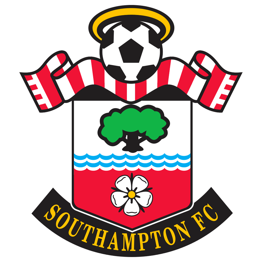 OK, so Southampton’’s badge is totally ridiculous, but you can’t help but kind of love it. Why does that cartoon football have a halo? Why is that tree planted in the sea? Fuck knows, but I’m having a lot of fun looking at it.
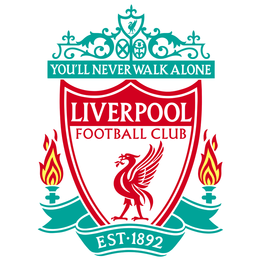 Liverpool’s badge had to be number one, not just because of how it looks, but because of the meaning behind it. It’s got the city’s liver bird at the centre, and even more importantly, the two eternal flames remembering the victims of the Hillsborough disaster sitting on either side. A representation of the famous Shankly gates tops the club’s even more famous motto, meaning this crest pretty much has it all – it’s just a shame they don’t use it on the shirts any more.
Explore more on these topics:

Sport

Sport

Sport
New details emerge after Italian journalist brutally killed and set on fire
The 53-year-old’s body was discovered in the southern Italian province of Salerno on Sunday (19 July) Football journalist Luca Esposito has died near Eboli in Italy, as reported by European Federation of Journalists and news network Rai. Esposito’s body was found badly burned near farmland after firefighters were called to a fire in the area. The […]
Sport
6h
Amazon billionaire Jeff Bezos ‘approached’ with opportunity to buy PL giants
The world’s fourth richest man could soon be a Premier League owner. Amazon’s multi-billionaire owner Jeff Bezos has been approached to join a consortium who are in the process of buying a 30% stake in one of the Premier League’s biggest clubs. The American tycoon, and owner of Amazon, Blue Origin and newspaper the Washington Post, […]
Sport
10h
Sport
Sport


