


Entertainment
Share
Published 11:20 4 May 2016 BST
Updated 11:25 4 May 2016 BST

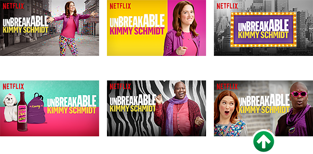 Another important factor is how many people are in the image. Images with three or less characters tend to perform best, whereas anything over three is seen as overkill - especially when people are browsing on a smaller screen.
Netflix used that logic when redesigning the thumbnail for Orange Is The New Black, which was a bigger hit when it had less of the ensemble cast in the image.
[caption id="attachment_57444" align="alignnone" width="1280"]
Another important factor is how many people are in the image. Images with three or less characters tend to perform best, whereas anything over three is seen as overkill - especially when people are browsing on a smaller screen.
Netflix used that logic when redesigning the thumbnail for Orange Is The New Black, which was a bigger hit when it had less of the ensemble cast in the image.
[caption id="attachment_57444" align="alignnone" width="1280"]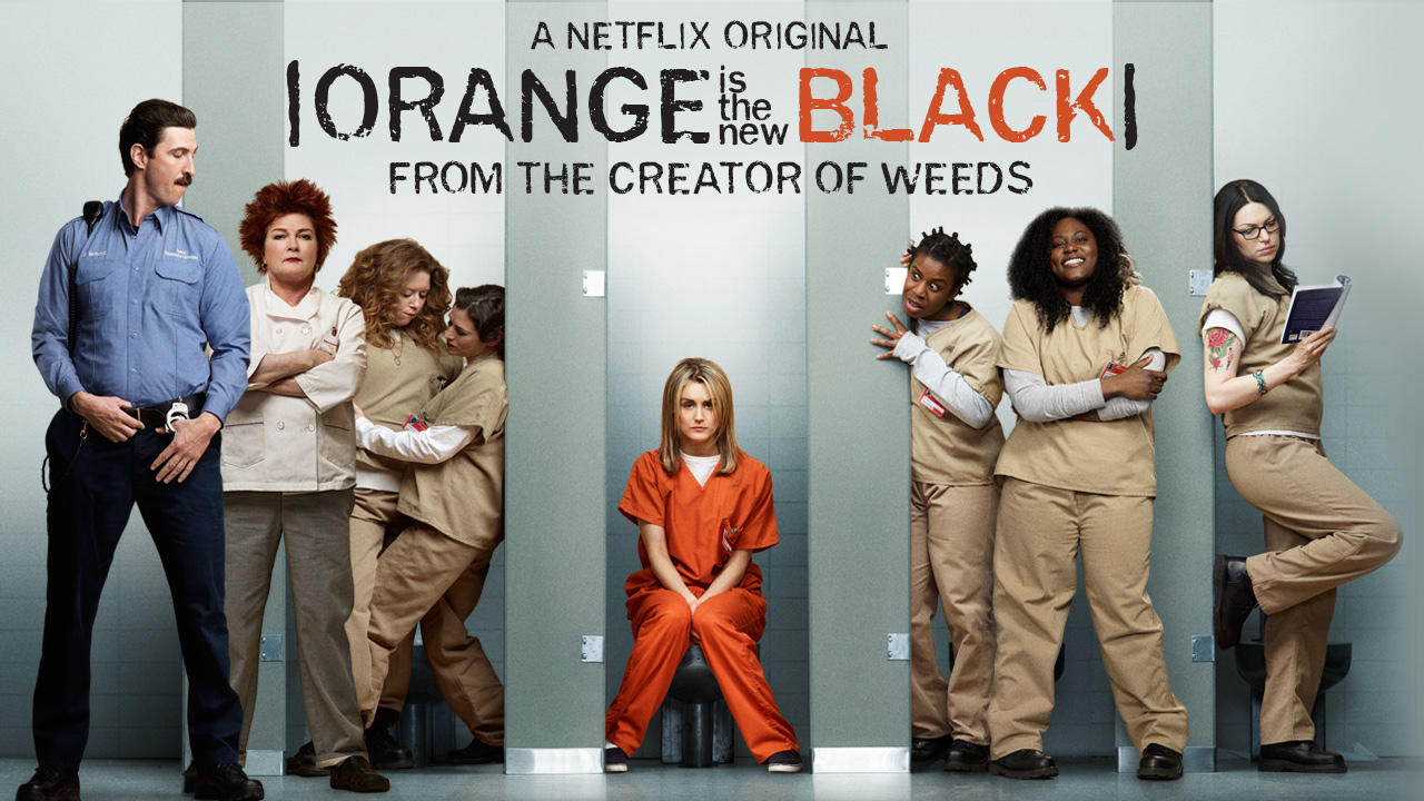 Season 1[/caption]
[caption id="attachment_57445" align="alignnone" width="1280"]
Season 1[/caption]
[caption id="attachment_57445" align="alignnone" width="1280"]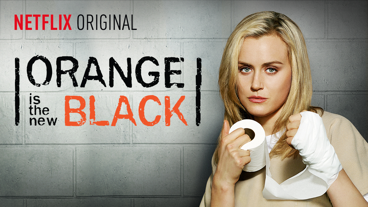 Season 2[/caption]
[caption id="attachment_57446" align="alignnone" width="572"]
Season 2[/caption]
[caption id="attachment_57446" align="alignnone" width="572"]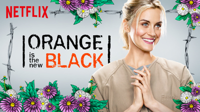 Season 3[/caption]
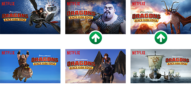
Finally, the study also found that people are often more drawn to "polarising" characters, i.e. baddies and villains. This is especially relevant in kids and action movies, and they used the example of Dragons: Race To The Edge (a spinoff of the film series How To Train Your Dragon) to indicate that the bad guys pulled in the biggest audience.
Season 3[/caption]
Finally, the study also found that people are often more drawn to "polarising" characters, i.e. baddies and villains. This is especially relevant in kids and action movies, and they used the example of Dragons: Race To The Edge (a spinoff of the film series How To Train Your Dragon) to indicate that the bad guys pulled in the biggest audience.
 So there you have it. Now you know the psychology behind Netflix's imagery, you should never be duped by a rubbish Noughties Adam Sandler movie again.
The JOE Film Club Quiz: Week 107
Entertainment

‘Rip-off’ contracts costing Brits £576 a year
Entertainment

Entertainment

Entertainment
The JOE Film Club Quiz: Week 107
Entertainment
The JOE Film Club Quiz: Week 107
Entertainment
‘Rip-off’ contracts costing Brits £576 a year
Entertainment

Entertainment

Entertainment
The JOE Film Club Quiz: Week 106
Entertainment
Kit Connor and Joe Locke reflect on the emotional end of Heartstopper
‘The end of an era’ After four years, three series and a devoted global fanbase, Netflix has officially brought Heartstopper to a close with the feature-length finale, Heartstopper Forever. The film picks up directly after the events of series three and follows the couple as they face one of the biggest changes in their relationship […]
Entertainment
4 days ago
Claudia Winkleman confirms BBC chat show exit after one series
Claudia Winkleman’s Friday night sofa has been packed away The Claudia Winkleman Show has officially come to an end after just one series, with Claudia Winkleman deciding not to return for a second run. The BBC chat show, which launched in February, was created as a Friday night companion to The Graham Norton Show while […]
Entertainment
5 days ago

Entertainment
The JOE Film Club Quiz: Week 105
Entertainment


