


Entertainment
Share
Published 11:07 25 Oct 2016 BST

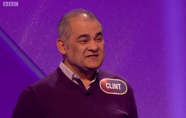 That is what happens when you don't sort your kerning out. A lovely gentleman called Clint turns up on tele with a nametag that looks like... well... y'know.
It didn't take long for Pointless viewers to start rubbing their eyes in disbelief.
https://twitter.com/PinkerbeIl/status/790592005634191361
https://twitter.com/Notts_Blade/status/790590552957911040
https://twitter.com/JQW/status/790590368748306436
Lovely lovely Clint is a property developer from Surrey, and popped up on the show with his son Colm.
"I have a love of Bruce Springsteen, the England football team and Colm," he told Richard and Alexander.
We're really sorry Clint. You seem like a lovely fella. But let's take this as an exercise in learning proper kerning.
https://twitter.com/Antiguamann/status/790590292915261440
https://twitter.com/markhopping1/status/790590009611018241?ref_src=twsrc%5Etfw
You can catch up on the latest episode of JOE's Football Friday Live right here…
That is what happens when you don't sort your kerning out. A lovely gentleman called Clint turns up on tele with a nametag that looks like... well... y'know.
It didn't take long for Pointless viewers to start rubbing their eyes in disbelief.
https://twitter.com/PinkerbeIl/status/790592005634191361
https://twitter.com/Notts_Blade/status/790590552957911040
https://twitter.com/JQW/status/790590368748306436
Lovely lovely Clint is a property developer from Surrey, and popped up on the show with his son Colm.
"I have a love of Bruce Springsteen, the England football team and Colm," he told Richard and Alexander.
We're really sorry Clint. You seem like a lovely fella. But let's take this as an exercise in learning proper kerning.
https://twitter.com/Antiguamann/status/790590292915261440
https://twitter.com/markhopping1/status/790590009611018241?ref_src=twsrc%5Etfw
You can catch up on the latest episode of JOE's Football Friday Live right here…
Explore more on these topics:

The JOE Film Club Quiz: Week 107
Entertainment

‘Rip-off’ contracts costing Brits £576 a year
Entertainment

Entertainment

Entertainment
The JOE Film Club Quiz: Week 107
Entertainment
The JOE Film Club Quiz: Week 107
Entertainment
‘Rip-off’ contracts costing Brits £576 a year
Entertainment

Entertainment

Entertainment
The JOE Film Club Quiz: Week 106
Entertainment
Kit Connor and Joe Locke reflect on the emotional end of Heartstopper
‘The end of an era’ After four years, three series and a devoted global fanbase, Netflix has officially brought Heartstopper to a close with the feature-length finale, Heartstopper Forever. The film picks up directly after the events of series three and follows the couple as they face one of the biggest changes in their relationship […]
Entertainment
2 days ago
Claudia Winkleman confirms BBC chat show exit after one series
Claudia Winkleman’s Friday night sofa has been packed away The Claudia Winkleman Show has officially come to an end after just one series, with Claudia Winkleman deciding not to return for a second run. The BBC chat show, which launched in February, was created as a Friday night companion to The Graham Norton Show while […]
Entertainment
3 days ago

Entertainment
The JOE Film Club Quiz: Week 105
Entertainment


