


Sport
Share
Published 11:07 28 Aug 2020 BST
Explore more on these topics:
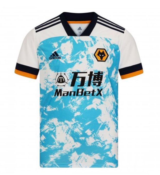 Firstly, the colours are a mess. White with black and amber (is it officially amber?) trim makes perfect sense for a Wolves away kit. You can tell it's them, but it's not going to clash at all with the home shirt. Nice. Good start.
But we need to talk about this blue. The pattern itself isn't inherently offensive but I would like to know how many people decided that yes, a light shade of bright blue was the way to go for Wolves' away shirt.
Also - I'm almost done - I know it's adidas' template this season, but I can't shake the feeling that it might look less offensively ugly if the pattern covered the whole shirt, rather than from the nipples down.
Anyway people must like it because there's currently a long queue to get on the website. Am I out of touch? No, it's the designers who are wrong.
https://twitter.com/Wolves/status/1299255538962890754
Firstly, the colours are a mess. White with black and amber (is it officially amber?) trim makes perfect sense for a Wolves away kit. You can tell it's them, but it's not going to clash at all with the home shirt. Nice. Good start.
But we need to talk about this blue. The pattern itself isn't inherently offensive but I would like to know how many people decided that yes, a light shade of bright blue was the way to go for Wolves' away shirt.
Also - I'm almost done - I know it's adidas' template this season, but I can't shake the feeling that it might look less offensively ugly if the pattern covered the whole shirt, rather than from the nipples down.
Anyway people must like it because there's currently a long queue to get on the website. Am I out of touch? No, it's the designers who are wrong.
https://twitter.com/Wolves/status/1299255538962890754
Sport

Sport

Sport

Sport
World Cup 2026 prize money: The staggering amount the winners can earn revealed
If it’s coming home, here’s how much England will get Football fans need to gear up and stay up-to-date with the World Cup, as there are just a few days remaining for the much-awaited tournament. The World Cup this year is set to begin on June 11, 2026, and will be hosted across the USA, […]
Sport
4h
The best England and Scotland shirts to buy before World Cup 2026 kicks off
Get ready for the World Cup 2026 The FIFA World Cup 2026 kicks off on 11 June and this is where you can buy the official – and unofficial – shirts for England, Scotland and more. Scotland’s first match will take place at 1am on 14 June, while England kick off their World Cup campaign […]
Sport
4h
Quiz: Can you name every Brazilian player to play for Manchester United
Sport


