


Sport
Share
Published 14:56 22 Jul 2019 BST
Updated 11:07 23 Jul 2019 BST

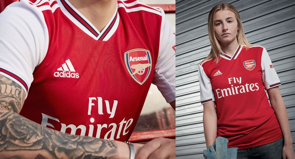 Not much to say with this one. It's an absolute beauty (and look even better without its sponsor) and sees the return of the perfect pairing of both Arsenal and adidas. Simple, sleek and classy - it's the perfect football shirt.
 Like Arsenal's shirt, this is simple and classy. The round collar is a treat, as is the sight of the Puma logo in the middle above the monochrome Newcastle badge. This version features a specially used logo for the club's Chinese tour, which is nicer than the the FUN88 logo, but regardless of sponsor this is just lovely.
 I repeat, simple football shirts work better. You don't anything overly messy or high-tech. Just some nicer colours and patterns. This has all of those things in abundance.
 Again, a simple design pays off. Black and red shirts just work, as proven by AC Milan's kits over the years, and this is an example of that. The gold on the crest works well off the gold on the sponsor logo. A real treat.
 The bruised banana has returned. This one is really nice, and would be higher up were it not for the distinct lack of red throughout. Still a great effort and the sort of shirt you'd be happy to wear around town.
 This is the classic Kappa shirt. Fitted with a clean design, and only lifted by the Villa colour scheme. The W88 logo actually looks decent as well cast against the claret. Lovely kit.
Bonus points for Tyrone Mings being very, very handsome.
This is the classic Kappa shirt. Fitted with a clean design, and only lifted by the Villa colour scheme. The W88 logo actually looks decent as well cast against the claret. Lovely kit.
Bonus points for Tyrone Mings being very, very handsome.
 Lovely colour. Simple design and colour scheme. Umbro and West Ham have knocked it out of the park this year, to be fair.
 This is weird and shouldn't work, but it does. Maybe it's because it's on David Silva, but based on the usual fan's barometer of how likely they would be to wear a shirt outside the house, this is quite high.
 Another Umbro entry, and for good reason. While their efforts for Bournemouth and West Ham have been really simple, this one has an interesting crosshatch pattern that works very nicely. Still has the Angry Birds logo on it, unfortunately.
 While Nike's efforts with Tottenham's home shirt have often left a lot to be desired, this away shirt is rather lovely. Not going to win any awards but a decent effort.
 Kappa have done a fine job here. Simple colour scheme and design. Personally I'm a sucker for the extra Kappa logo on the shoulder, so that is a plus for me.
 I liked this initially, and I still like it now. Watford have had some duds over the years but this is not a dud.
 This is a lovely and snappy effort. The V-neck is simple, the red detail on the sleeves works, and there's a tasty little pattern in there somewhere. It's a nice shirt.
 This is apparently 'inspired by mod culture' and it shows. Mods tend to look pretty sharp, and this shirt is pretty smart.
 This is a cool shirt. The white lines make it. Very good.
 Are these sound waves? Is it just noise? I don't understand this shirt but I like it.
 This is okay, but there's something about it that I don't quite like. I can't put my finger on it. If you can figure out what's bugging me about this shirt please let me know.
 We're reaching the lower side of good shirts here now, to be honest. Not quite bad but not great, some exemplified by this Leicester shirt. The chequered pattern is nice - as are the gold adidas lines - but this looks too much like a training top you can buy online for £20.
 This is literally an adidas training top you can buy online for *checks notes* £16.46.
 This is a white and dark blue Tottenham home shirt. I don't think there's anything more you can say.
 Very, very basic, but the colour scheme just about saves it from being simply bad.
 A plain black T-shirt. Some people will like it. Others won't. It's a firm 'meh' from me.
 A daring choice by all involved to go with blue and white stripes for Brighton's home shirt.
 This shirt has a pattern that looks like the logo for a TV production company in the mid-80s.
 Wolves had a lovely home shirt last season, and now they have this one. If I was a Wolves fan I'd be disappointed.
 This is undeniably a home shirt - no one can take that fact away from Norwich City.
 Burnley's home shirt is West Ham's from three seasons ago. There are few sentences which sum Burnley up better than this.
 You'd be forgiven for thinking this is actually quite nice. The colour is okay and for once United's Chevrolet sponsor doesn't stand out like the sore thumb it is. But then you get closer and realise its pattern is snakeskin, which makes as much sense as modelling the pattern on the surface of Mars. It's silly. No thanks.
 This shirt is probably 'inspired by London' or something. But it looks odd, and has a strange fit where it just hangs off the body. It's hard to mess up a plain blue kit, but here we are.
 Another effort that looks like you could get it for discount on some outlet store website. Particularly disappointing considering how smart their last two home shirts have been.
 There's simple and then there's basic and this is just basic. Must do better.
 This is bad. The colours work well together but everything looks like it's in the wrong place. Just weird.
 Ah yes, those famous Manchester City colours of baby blue and, erm, purple. This doesn't look like a really football shirt, in truth. I'm not convinced someone at Puma didn't just spot a concept kit online and go with that.
 This shirt has a decent pattern on its arms. But that is genuinely it. The red and yellow doesn't really work well together and the neck on it is just weird looking. A poor choice all round.
 Do you remember when you were a kid and you'd get Pro Evo and you'd try and design the kits of your favourite team? Yeah, this is the fruits of your labour. The awfulness of this kit is made even funnier due to the fact that United will be wearing a shirt designed to commemorate their Treble win while playing in the Europa League.
 Weird looking sponsor. Awkward manufacturer and crest placement. This is a mess. Bin it now.
 We used to drink this shirt on nights out at uni for £1 a pint. Then we'd wake up feeling like our heads were being excavated.
Explore more on these topics:

Sport

Sport

Sport
New details emerge after Italian journalist brutally killed and set on fire
The 53-year-old’s body was discovered in the southern Italian province of Salerno on Sunday (19 July) Football journalist Luca Esposito has died near Eboli in Italy, as reported by European Federation of Journalists and news network Rai. Esposito’s body was found badly burned near farmland after firefighters were called to a fire in the area. The […]
Sport
19h
Amazon billionaire Jeff Bezos ‘approached’ with opportunity to buy PL giants
The world’s fourth richest man could soon be a Premier League owner. Amazon’s multi-billionaire owner Jeff Bezos has been approached to join a consortium who are in the process of buying a 30% stake in one of the Premier League’s biggest clubs. The American tycoon, and owner of Amazon, Blue Origin and newspaper the Washington Post, […]
Sport
1 day ago
Sport
Sport


