Oh, Leeds United. Silly, silly Leeds United.
Unless you’ve been living under a rock or are one of those sensible people who aren’t on social media, you will know that the Yorkshire club unveiled their new crest this week.
The result of 6 months work which also saw the club consult 10,000 people, the Leeds Twitter account proudly posted the new crest with the tagline “Ready for the next 100 years”.
What followed was an evisceration the likes of which actually makes you feel proud of social media and its power to do good, or at the very least its power to direct thousands of mocking messages at a professional football club.
6 months of research
10,000 people consulted
Ready for the next 100 yearsWatch video ➡️ https://t.co/rIIdL2Yz9F pic.twitter.com/pMrd3zTjCl
— Leeds United (@LUFC) January 24, 2018
It’s gone down so badly that the club have already announced that they are going to “reopen the consultation process” on the new badge.
While casting our eyes across this monstrosity that appears to depict a middle-aged man during an attempt to “get down” with the urban youths, we couldn’t help but think of all the other crests out there in this big bad world of ours.
So, on that note, we’ve compiled the definitive list of the best and worst crests of all time.
Okay, let’s start with the good crests.
Ajax
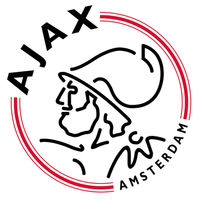
A classic crest – Ajax’s features key components (the club’s name) and the stylised head of Greek hero, Ajax. It’s clean, has the club’s colours and is one of the best crests going.
CSKA
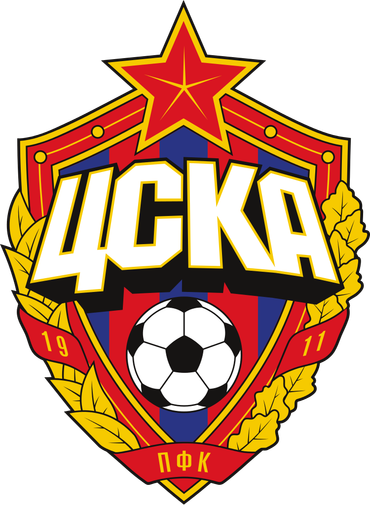
What can I say? This crest has it all: a Soviet font, a football, leaves etc. The colour scheme is beautiful and every facet of it is in perfect proportion to the others. It makes me want to join the Communist Party. Enough said.
Inter
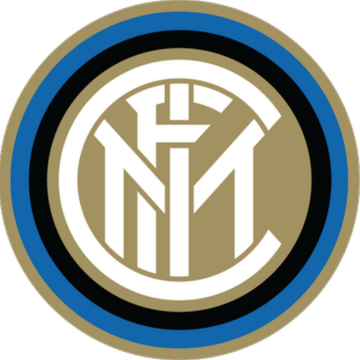
Yes, Inter’s old crest was better, but that doesn’t mean this isn’t also very good. It’s no frills, which most every crest should be, and oozes class. It’s just lovely.
Valencia
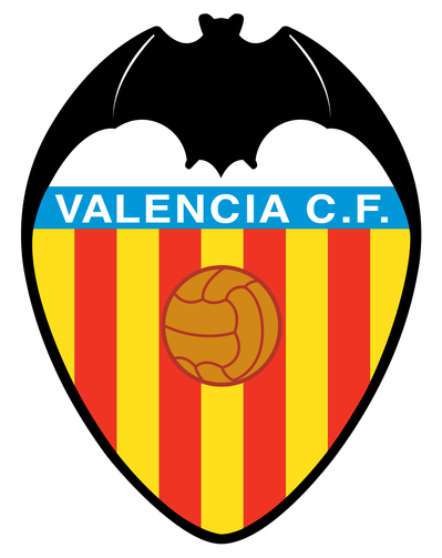
Ok, I know I just said crest should be no frills, but that rule doesn’t apply to crests that contain bats who appear to be launching a catapult using their wings. This crest is about as Spanish as you can get and the addition of the olden days football only adds to its charms.
Vasco da Gama
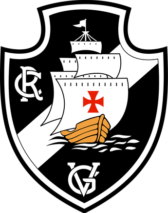
It’s a pirate ship sailing into the night. Case closed.
Pumas UNAM

Club Universidad Nacional, or Pumas UNAM, are a Mexican side who lay claim to not only one of the best crest in the world, but also what is probably the best jersey (look it up, you won’t regret it). Like their jersey, the crest is minimalist with the puma front and centre. The gold and navy works perfectly and it’s a treat.
Palmeiras
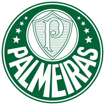
The first green addition to our list, this Brazilian team’s crest is quite funky. If you squint, it sort of looks like a chameleon curled up. It looks kind of trippy, has a lovely font and a smaller badge that I feel is pretty sharp.
Kaiser Chiefs

Not enough teams have yellow and black as their colours, and they really should. Thankfully, South Africa’s Kaiser Chiefs do and it works to great effect in their badge. Minus some points for the use of two footballs, but still a visually appealing number.
Palermo
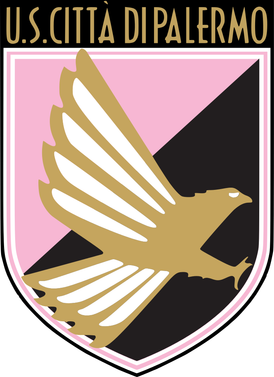
This is just really cool. A golden eagle, the famous Palermo pink and the a beautiful art deco typeface. Nothing more really needs to be said.
LAFC
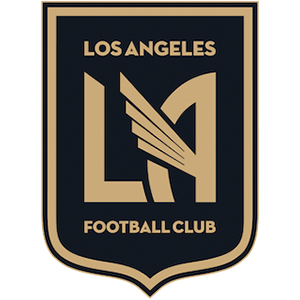
Los Angeles Football Club are a new MLS team which has yet to even play yet. But they’ve already made a good impression with this absolute beauty of a crest. Like the Palermo number, it’s got art deco vibes, while the simple black and gold colour scheme has a look of old school Hollywood glamour. Just lovely.
Now, we move onto the worst in the world, ones which will make your eyes weep with sadness at an opportunity lost.
Venezia FC
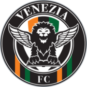
This Venetian team are making strides in Italy with Pippo Inzaghi as their coach. Unfortunately their crest is a nightmare. In theory, a lion with wings should work, but his creepy smile just ruins it.
Rayo Vallecano
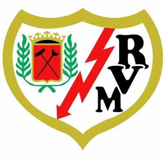
Rayo are a nice football club who often champion progressive causes. Sadly their crest looks less like a football team and more like a news segment graphic about an economic crisis. Not good.
Burnley
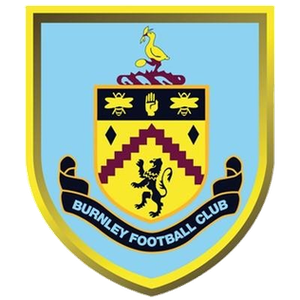
Looks like it’s been made on Minecraft. NEXT!
MK Dons
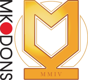
Say what you like about MK Dons and how the club came to be, but nothing is worse than their crest. It looks like the logo of a shady real estate company, while the “MMIV” appears to be a rather lame attempt to make the club look more historic than one which relocated in 2004. Possibly the worst on this list.
Willem II
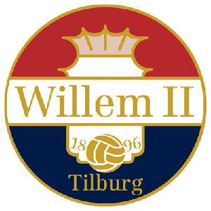
Looks like the label off a beer you’d buy at Aldi.
New England Revolution

This has all the hallmarks of Microsoft Word Clip Art. It is hideous and has no place in the game.
Well, that’s our list. Do you agree or have we really messed up here? Let us know how you feel and feel free to send us the crests you believe should have been concluded.